Designing paid components for a popular free app
Free App success
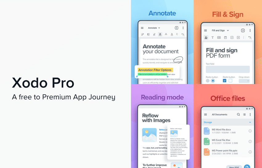
Xodo is a document reading/editing productivity app competing with the likes of Adobe Mobile, and Microsoft Office Mobile. It launched as a showcase app for demonstrating our PDF SDK capabilities to customers and investors. Of course, the showcase project soon turned into something much bigger.
10 million+ downloads and 4.7 ratings.
Vision
In early 2021, the company realigned our B2C focus to become a reliable revenue channel. The big picture goal was to move towards self-sustained B2C app sales and eliminate the sales team involvement in selling licenses for our platform apps and focus on SDK sales
The B2C Revenue Focus comprised 2 key goals:
- Key Result 1: Reach $200000 Incremental ARR in < 12 months without any marketing push
- Key Result 2: Maintain a 4.6+ user rating
So today, I will be painting this journey of how we designed the paid portions of this new version of the app - Xodo Pro
- Design Highlights from 4 pro features
- Designing 4 upgrade touchpoints
- Decisions around upgrade flow
- Price increase failure
- Adding value to the Pro offering
My role
- End to End design as a Lead designer of Xodo
Viewer Pro Pack
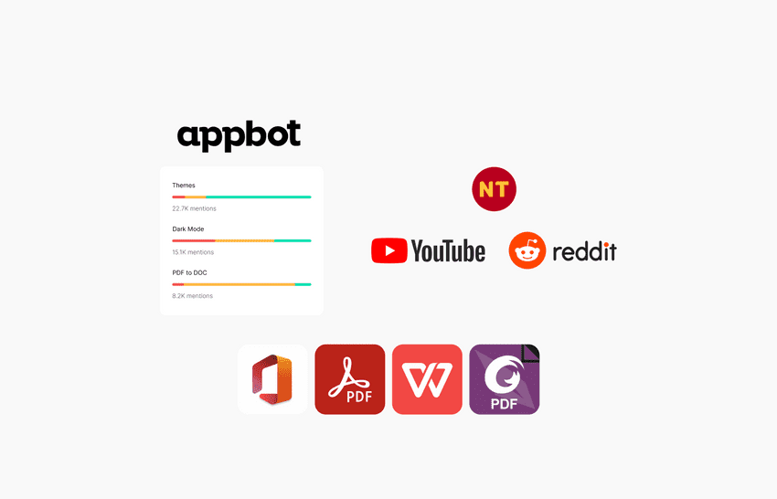
Analyzing all customer usage data available to us, we outlined the top 5 user requests surrounding value additions to the app and prioritized those requests to be our baseline for this new subscription offering. We used data sources like thematic analysis of app reviews, social media digital notetaking communities and competitive market audits.
Custom Theme Support
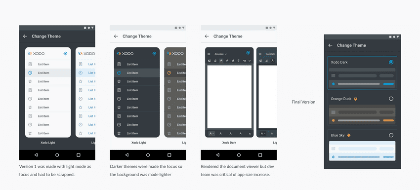
Required developer effort to lay down the foundation for styleable components across the app. Therefore, the release took a long time for getting the old legacy viewer code to be styleable across the board. The design team came up with a theme switcher carousel idea and we populated it with some old light mode themes we had designed for another scrapped product release.
Judging by the user demand we had to go back to the drawing board and introduce more dark themes. This also meant that our switcher had to evolve with it.
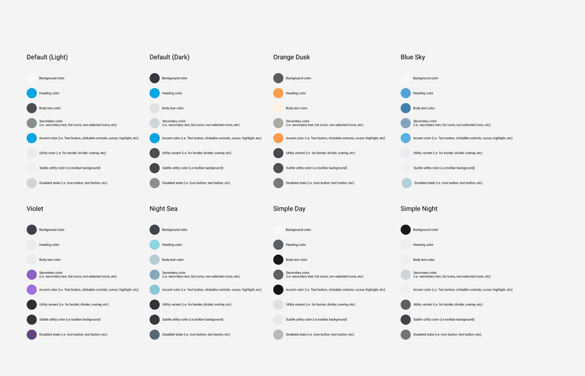
Themes Palette
We switched the switcher background to a lighter colour to allow the darker themes to shine, however, our hotlist (focus group) users said, following the system theme was the best choice as all other apps do that. We even tried a crazy idea to render the whole document viewer inside the switcher however, engineering said it was a wasted effort and would increase app size by introducing static png assets. So we all settled on a very simple representation of each theme as an abstract card which was easy to scale and we followed the system theme as the background.
Themes switcher evolution
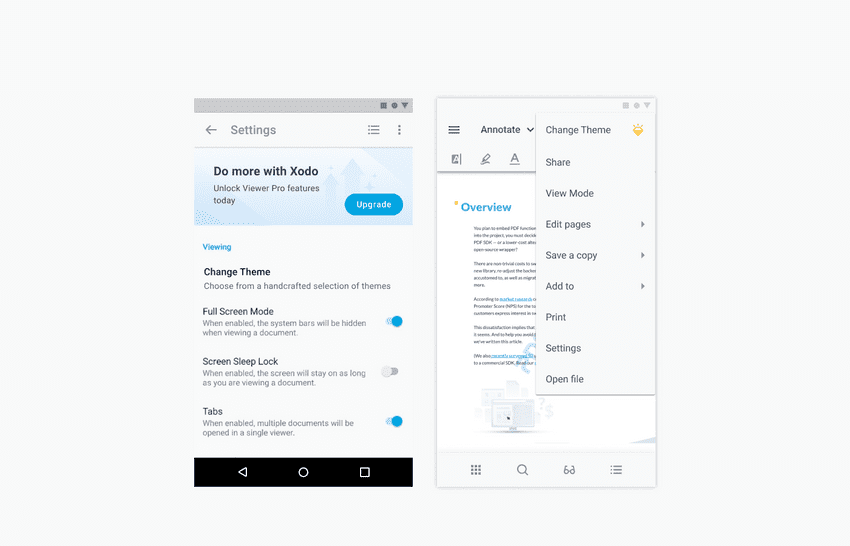
We released the theme switcher version 2 to our alpha/hotlist users (1100 active users). The impressions percentage for the switcher was single-digit poor. The discoverability was negligible. The “change theme” option was only on the app settings page and almost all users directly load into viewing a pdf file. Theme switcher was up to 44% impressions.
Themes switcher entry point changed from app settings page to document viewer
PDF to Word
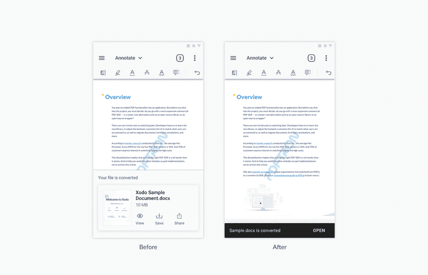
2nd popular request that we monetized was pdf to word export. We monetized this action as there was a cost associated with each conversion as this was a server-based export feature. The placement of the word export was kept under the existing export sub menu in our overflow which the users were already familiar with to process into other formats.

For the result, we tried a bottom sheet, however, the internal test showed 95% of users were interested only to open the file, so we simplified it down to a simple snack bar with a single action to open the file
Bottom sheet to a simplified snackbar idea
Favoriting Tools
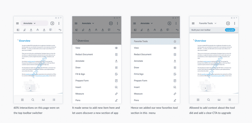
Users wanted the ability to set favourite tools as over the years due to feature creep and market parity, our toolset became large and people demanded quick access to tools of choice. This was a power user demographic request so we also decided to monetize this. A premium for value addition to saving time cumulatively over a long period of usage.
Design journey of our Favorite tools
Smart Pen
Finally, the most asked-for feature from our digital notetaking, academic userbase- a faster way to switch between highlight and freehand draw tool. The idea was to shorten the time between switching the tools.
We took a deep look at the problem definition- to reduce friction between the tool switching. What if we found some way to make that smart and automatic instead?
With the help of the dev team, we prototyped a dual-function interaction. If you are in the highlighter tool, and you start drawing over non-text regions, the tool will automatically switch to a free-hand draw tool. Similarly, if you are drawing over non-text regions, and you start highlighting text, it will switch to the highlighter tool automatically.
However, In the internal user testing, the idea of tools switching in the toolbar based on what you do was too distracting
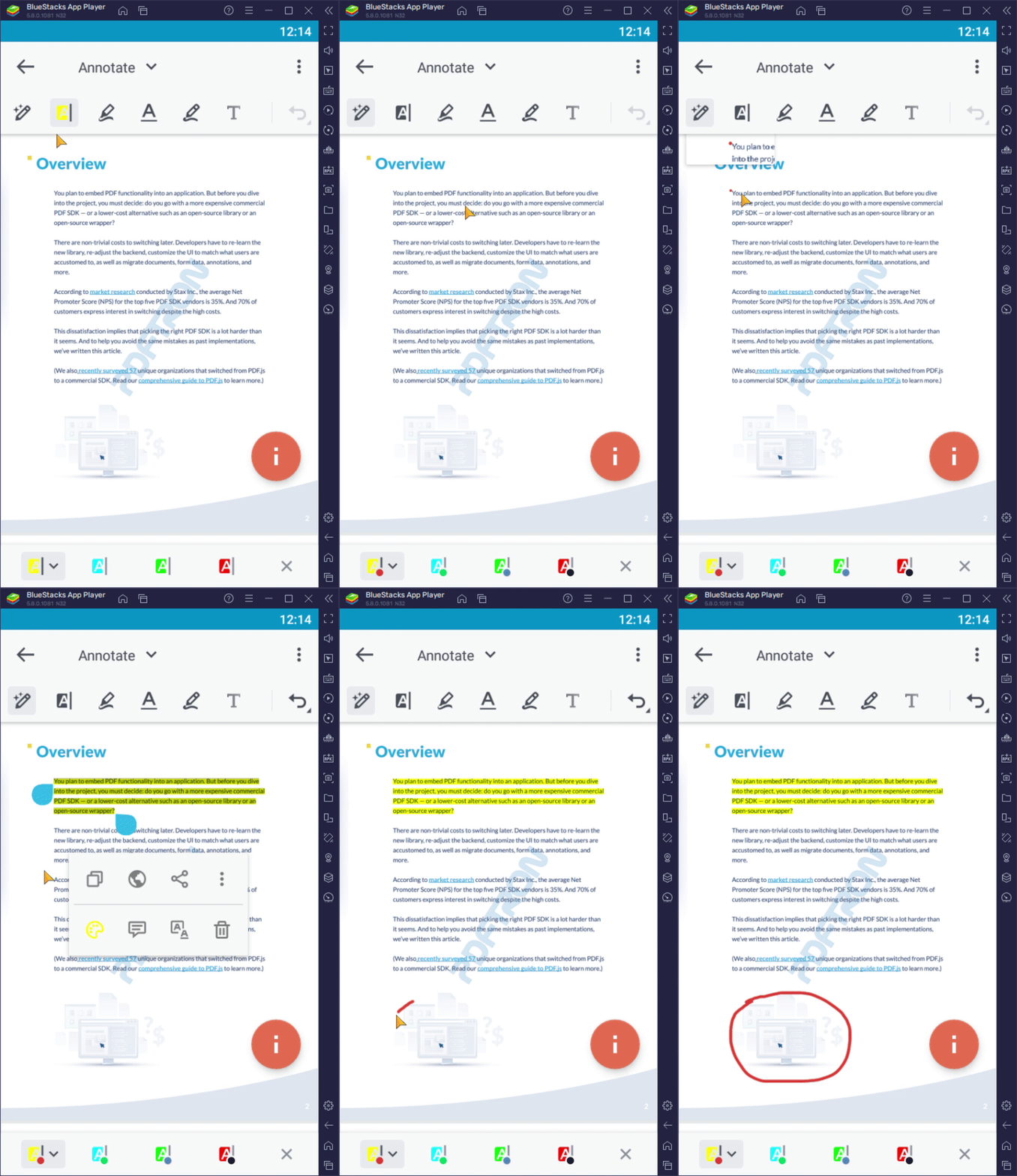
Smart pen prototype
Upgrade Touchpoints
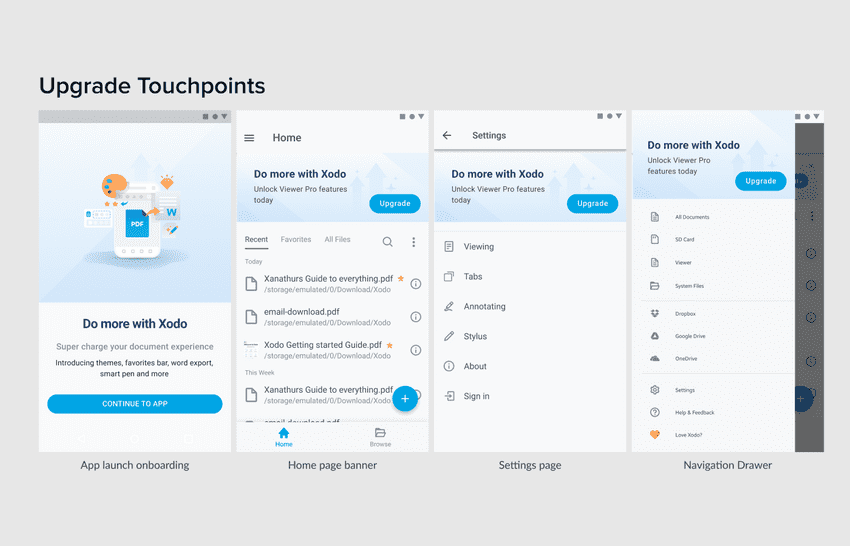
We came up with four possible spots for floating our upgrade banner or educating about this new Pro Pack.
- App onboarding
- Homescreen
- App settings page
- Navigation side drawer
Upgrade touchpoints for Xodo Pro
We did roll out the banner release to our hotlist, as we wanted to measure click-throughs. Surprisingly the highest was from the nav drawer. We followed the user sessions and found the reason. 84% of users directly open pdf files, users hardly open the app and then select the file, it always directly opens the file into the viewer and the only banner easily accessible from the viewer was the hamburger side drawer.
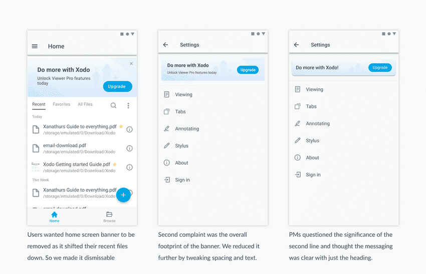
Also over the time of the hotlist release, we even evolved the visual footprint of the banner
Visual evolution of our Banner
Upgrade Flow
The PMs gave us a requirement list for the screen
- Show feature set visually
- Have a free trial cta
- Monthly/yearly package selection
- Signify the best offer/value
- Annual package price is shown/per month as well (more lucrative)
- T*C line /recurring billing/cancellation
- Dismiss page button
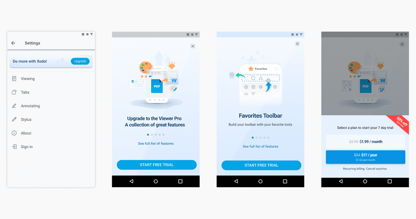
Key Elements for Upgrade Flow V1
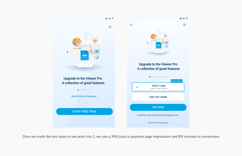
We monitored the beta release for 3 weeks, overall app engagement was great but something was off, our users approaching this 1st screen were not even reaching the package plan selections. They didn't even see our monthly and annual package prices (6% payment page impressions)
So, we made a month and annual plan selection easily discoverable as part of the upgrade screen. Instead of 2 steps just one. The sales team informed us - certain countries do not support a free trial - we had to add a byline to state that. For store compliance, regional currency qualifiers like CA/SGD had to be added as well. We removed the striking red discount banner, made the plan callout more simple and made the main cta text more inviting ("Try Now")
Xodo Upgrade flow improvement
Goal Check In - After 7 months in
Our Targets
- Key Result 1: Reach $200000 Incremental ARR in < 12 months without any marketing push
- Key Result 2: Maintain a 4.6+ user rating
For KR1 we reached 60000 ARR in the first 7 months, our KR2 was also standing great, and the user reviews were also not being affected. The leadership and app sales team decided to discontinue the early bird pricing right at the 7-month mark and do a ramp-up on our unit price offering to match competitors.
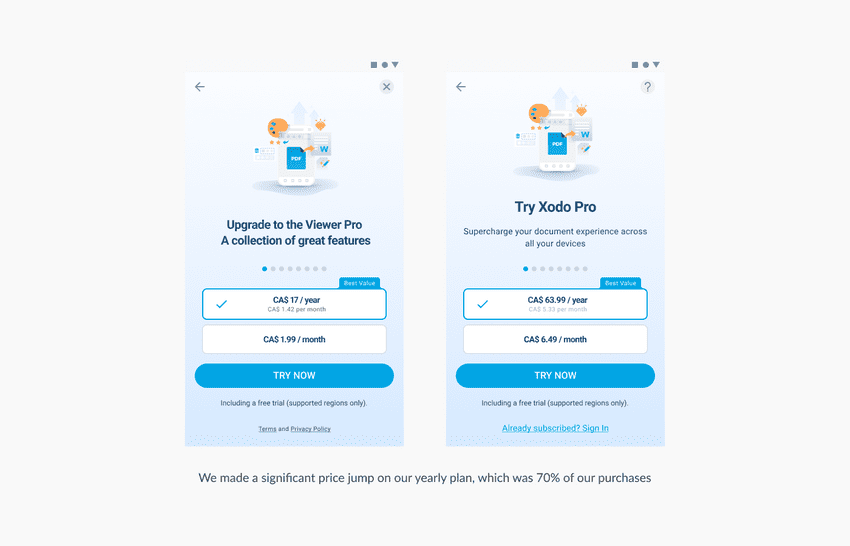
Xodo Price Increase
Price Increase Failure
We did a 15% rollout of revised xodo with the increased pricing. Post the honeymoon period of 3 weeks, sales flatlined.
KR 1: We flatlined after 100K revenue and we were sure we wouldn't reach the 200K ARR in 4 months KR 2: Our review scores dropped to 4.57 and we were very close to dropping further so that was a failure as well
What went wrong?
We went for closing the gap on market price parity with adobe, and the big players too early without assessing if we were offering feature parity. Mobile users are very price sensitive and will go for alternatives for the same. We paused the rollout and reassessed the situation. We did increase the ticket price but are they getting increased value for the same?
Xodo Actions - Adding back value
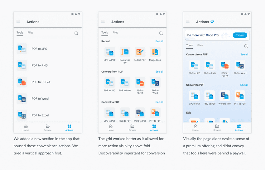
Sales and leadership said no to price reduction, so we had to add value to the pro offering to justify the price. Every competitor had some kind of utilitarian document actions. We could easily do that in a short amount of time and add a significant amount of value as our SDK capabilities were far superior to anything in the market
Xodo Actions Evolution
Still, the design team had one severe doubt about this whole thing, we felt users will ignore actions if they don't get a taste for it without paying upfront. The leadership response was the free trial but we felt it was not enough. We argued for a freemium approach. We pushed PMs for trying a 10% rollout with a freemium model and see if that sticks. If it had good conversions, we will go all the way with it.
Freemium Model
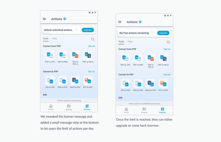
With document apps freemium = Limit the number of documents to process, limit the number of tools you can use per day and limit pages on files. We decided to go with limiting the number of actions you could process per day as our free paywall limit. We didn't want to get in the way of work
Xodo Freemium
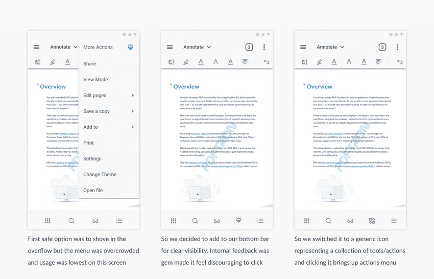
1200 new signups for the 10% rollout. To be honest, even this was not great. The entire actions section saw only 34% impressions. A very small section of users was seeing this page. The product said adding anything paid to the viewer upfront was very risky as this was very people came to be productive. However, with the freemium model, we could push for adding actions to the viewer as well.
Xodo actions in viewer
Where are We Today?
Xodo actions release launched in early 2022 and when I left pdftron, xodo was sitting at a 400K ARR and 4.64 ratings. So this was the journey to a premium mobile app experience and how we took the app one step closer to being a sustainable revenue source for our B2C channel
Thank you for reading this case study. If you want to know more about the project, email me or reach me via Twitter
