
Create and edit visualizations using gestures.
Why?
For casual to expert users, there is a need for tools that facilitate easy data exploration. Desktop tools like Tableau and PowerBI require a long and complex set of keyboard and mouse-based input to build visualizations.
To enable easier data exploration on the rapidly growing set of touch-enabled devices, I explore gesture-based interactions to construct and analyze visualizations.
Vision
We developed VizInteract to address three main design goals -
- Effective use of multi-touch gestures to interact with data.
- Easy-to-learn set of interactions
- Empower novice and expert users to easily explore data
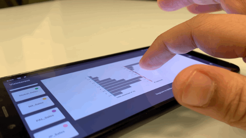
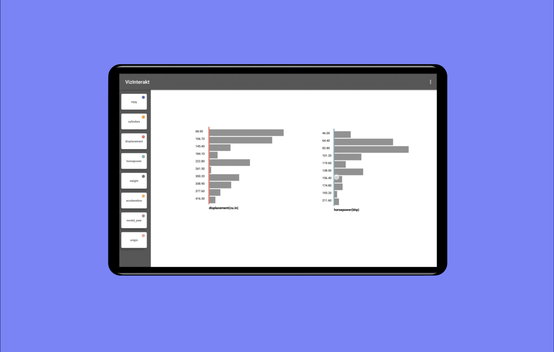
Bring two histograms close to create a visualization
My role
- Solo designer and developer
- Problem discovery, user research and testing
Market Research
A competitive analysis led to the following findings of existing tools:
- Most tools required detailed specifications from the user to create visualizations, sometimes even writing code.
- Some apps automatically generated visualizations. This prevented users to adapt the tool to their workflow.
- Mobile versions required additional pen input for accuracy. This reduced the speed and efficiency of workflows.
User Research
I pursued the research with an ethnographic case study approach. A semi-structured user interview was conducted with 16 participants, all aged between 22 to 28. All participants had experience with data visualization tools. These interviews helped me dissect the problem space and form our baseline user flows.

User flow for data visualization activities
Key Insights
- Users want to quickly compose charts and filter them.
- They are most interested in analyzing relationships between parameters
- They want to utilize these visualizations to find high performing variables
- They often query for details which can be both numerical or categorical
Opportunity
- Put multi-touch gestures as a first-class construct to allow easy exploration of data.
- Provide explicit dimension selection rather than automatic recommendations to provide more freedom to users
- Reduce visual complexity in the interface and provide easy-to-learn touch mappings
Prototyping
I began wireframing and prototyping the core flows and interactions of the application. It took multiple iterations to land on the design of the interactions. All mockups were designed on Sketch and the prototype was developed as a native Android app.

Prototyping the interactions
Usability Study
I ran a usability evaluation with 8 participants. I pre-screened the participants to ensure that they had familiarity with interpreting data visualizations. We also captured the usability feedback of the system using a 5-point Likert type questionnaire.
On the Likert results, we received a very high ease of use and learnability rating for our interactions.

Snapshot of usability evaluation
Design highlights
Creating scatter plots
To construct a scatter plot for two attributes, first change the orientation of any graph using a two-finger rotate gesture and then bring them close to overlap each other.
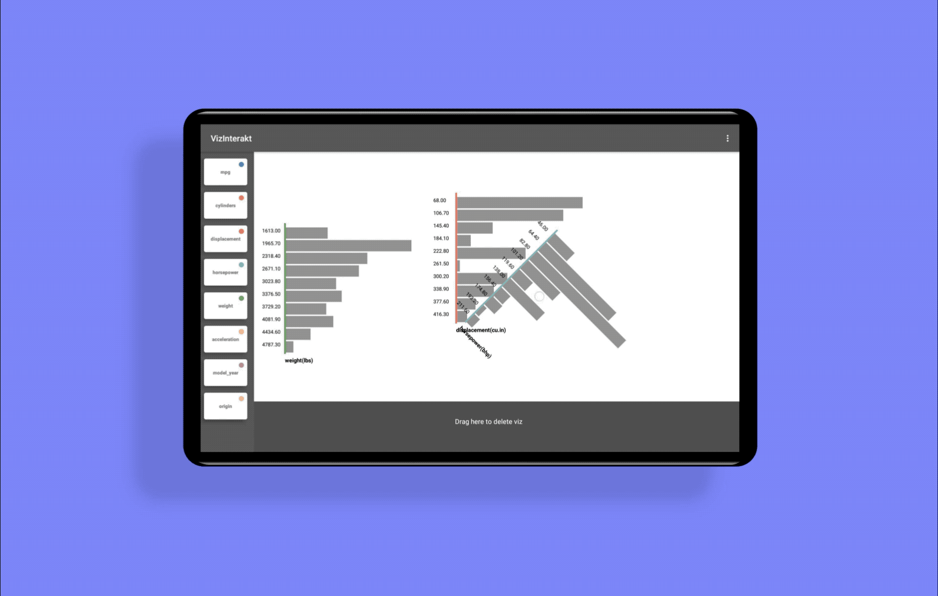
Creating a Radar Chart
Bringing the third attribute closer to two other overlapping dimensions at an angle, generates a Radar Chart.
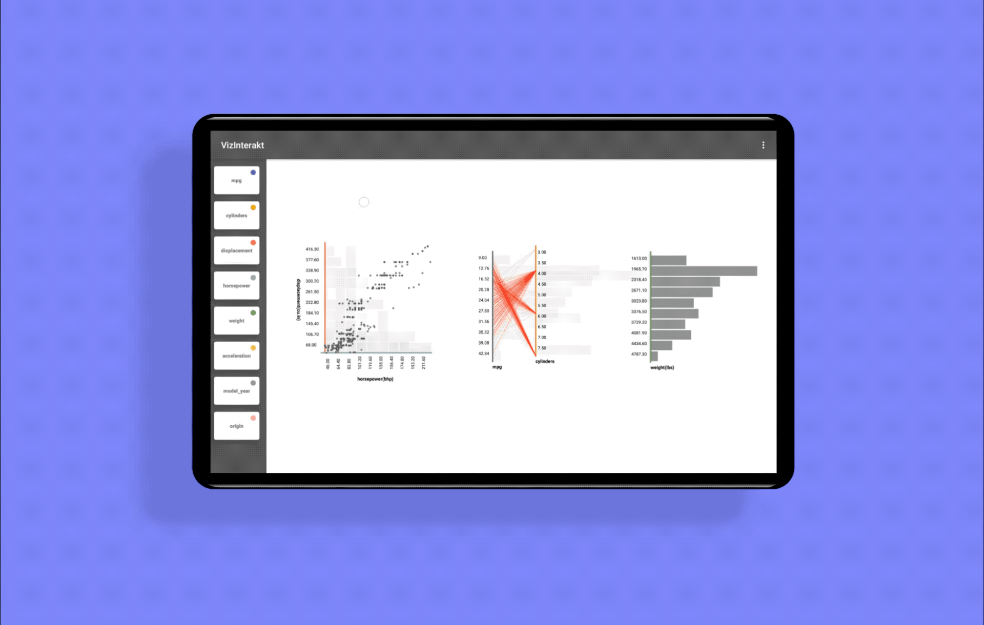
Brushing and linking
Dragging with one finger creates a rectangular selection box that highlights elements in yellow. This interaction is called brushing. If a region is brushed, all corresponding elements linked to that data are also highlighted, this is called linking.
Outcome
Dedicating two years of your life to a project is a big ask but my motivation came from the extremely valuable relations I built during the time, the sheer amount of research I conducted, and the opportunity to work on some nuanced interaction design. Sure, a lot of things changed on the way, both in terms of product and priorities, but there were some great takeaways from this project that I would like to share.
Constraints drive ingenuity
Strict timelines, minimum resources, and roadmap reprioritization required us to reposition our scope for the project constantly. During the initial few months, I was fighting off this mentality to tackle everything from a bird's eyes view. Slowly, over the coming months, I moulded my strategy to accept constraint-driven development and it sharpened our focus and commitment to deliver by a given deadline.
Space to iterate is essential
Even with laser-focused timelines, there were quite a few instances where we ran pilots with baseline ideas and improved gradually over a few versions. The thing keeping us on the check was good housekeeping before any new feature planning. We always went back to our drawing boards and collected thoughts from study results to find what and how to iterate on what was not working.
Understand when to converge
An active voice of critique is really helpful to set the tone and expectation of your usability studies. Sometimes your assumptions might not hold true and therefore won't converge to shippable ideas.
Business validation
We were wary of feature bloat from the get-go, hence committed to validating the business implications of every idea on the roadmap. We recruited a pool of data visualization experts who represented the biggest revenue-generating portion of our potential customer base. Their insights and feedback were critical and helped asses the external validity of our designs.
Thank you for reading this case study. If you want to know more about the project, you can find a technical document here