
This experimental projects takes the tedious problem of contact information entry and simplifies it through a natural language interface.
My role
- Discovery, ideation, interaction design, prototyping, testing, and development
Problem Statement
Let's consider a scenario: You are at a professional event and you meet someone interesting. You decide to save their details. You whip out your phone and open the contacts app. You go to 'add new contact' screen and you click through the various input fields and then finally click save.
Its a such a tiring process that it feels easier to not do it. How do you make this a smoother experience?
Contact management is not a new problem and has had its share of interesting developments over the years. From what began as a simple telephone directory, the contact management workflow now accommodates keeping and updating records of online profiles, special events, conversation history and more.
Its especially important today, that we keep a healthy habit of building, maintaining and communicating with our networks. These personal and professional relations are of utmost significance as they can often help accelerate career growth.
I intended to streamline this process of adding and updating details about my connections. It had to be a mobile-first workflow that would solve my problem of maintaining my growing professional network in Vancouver. Its interesting here to note that there wasn't any business goal to be achieved with this project. Merely personal curiosity
Design highlights
Contact Card
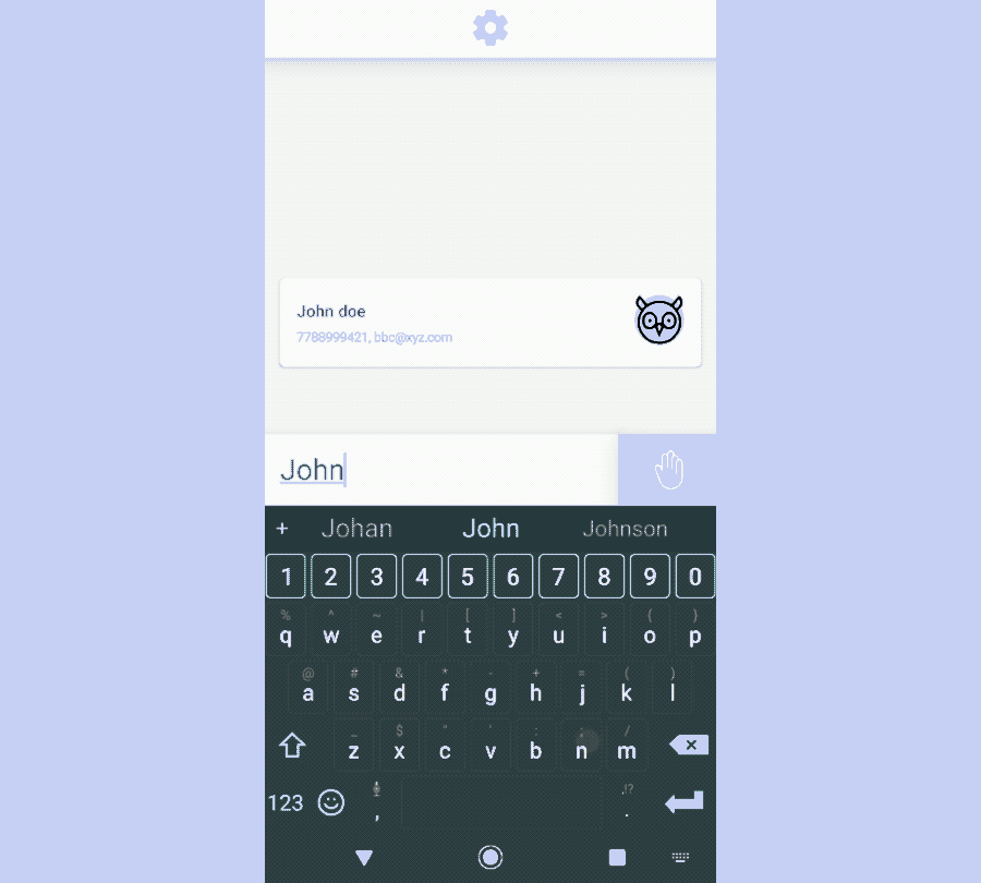
The contact card is the central point of all interactions in the app. The card is a swipeable component that animates out from the bottom and showcases the details in an organized manner. I intentionally kept the typography to be the primary way of distinguishing between different fields. The headings have a slightly weightier look to them while the less crucial information like their location and websites are smaller fonts. The lac of icons was also intentional as I feel keeping both icons and labels would have crowded the screen. Elements like phone numbers, email addresses and website links are all tappable and take you to respective apps to handle the information.

Where is the add button?
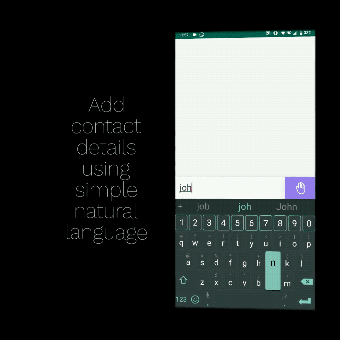
One of the design choices I was firm on was reducing screen clutter. I wanted to interweave interactions that made sense. I am a big fan of the natural language interface used by the calendar app for mac called Fantastical. It was probably the single biggest source of inspiration for me to build this app.
However, with calendar apps, the frequency of 'Adding events' is much higher than 'searching events'. In the case of contact apps, it's vice versa. Therefore, I had to prioritize the search interaction more than adding contacts.
Once you start typing out a query, the list filters down to show you relevant contacts. If you click on any result it will take you to the edit contact card screen. If you decide to keep typing out extra details like a phone number, email etc. It will automatically direct you to a new contact card flow.
Abstracted Machine learning
Designing a natural language interface requires one to rethink constraints of input. How do you make the query system feel dynamic yet make the user feel in control of the system? To begin designing the input system, I asked about 100 people how they would describe their colleagues in a professional statement. This fairly decent sized pool of statements allowed me to begin bucketing the helper phrases for different elements of contact details.

Delightful differences
One of my secondary goals with this project was to leave a genuine impression on anyone using this app. It could be either through microcopy, animations or visual delight.
My first concern was avatar design. I wanted to stay away from generic-looking avatars for contacts without profile pictures. Nobody has contact pictures for all of their contacts therefore the experience of scrolling through the list becomes far less inviting as it becomes an endless list of initials slapped on to boring looking circles.
I chose a licensed icon set of cute looking animals as the replacement for initials or blocky generic icons. This makes scrolling through the list fun. Every app launch randomizes these avatars so your best friend "Adam" might look different from the last time you interacted with him on this app.

The animal avatar set
The second concern was microcopy. I like adding small touches to my design that might make people stop and take notice of the artifacts they are interacting with. Case in point, when you click on the submit (wave) button with no text in the input field, the floating message prompt reads "Try something like Ada is a computer scientist at Bryon Industries", an homage to the pioneer ada lovelace.

Microcopy in QkContacts
Our Vision
This experiment has 3 major objectives:
- Speed up the process of adding and editing contacts.
- Use delightful yet subtle visual elements to convey action.
- Bring fresh perspective to a boring problem space.
Research
- Field Study Results: From a sample size of 100 professionals, we collected the training data for our language model. The variations in the way people introduce other people professionally gave us a lot of ideas for our parsing logic.
- Market Research: We analyzed 3 popular apps that utilize a natural language interface as part of the core user experience - Todoist, Fantastical and Google Assistant. The way Todoist handles backspaces alongside keyword detection was interesting. We utilized this mechanism to handle edge cases where the name of the person might include abstract words like 'is', 'at' etc.
Opportunity
The market has not seen active development in the past 3 to 4 years. The last major design idea to reimagine contact management was Evernote hello that tried to use camera-based scanning of business cards and faces together which frankly didn't work that well.
The simple model of using natural language as input allows easy extension of the core idea of contact management.
- Simple interaction recorder with keywords like "Just met Shubham"
- Contact reminder with keywords like "Remind me to call Shubham"
- Search all contacts working at Samsung
Explorations
A lot of designers that I have mentored in the past reach out to me and ask for advice on creating beautiful visual designs and my answer to that has always been "Slow and Patient Iteration". The very first time I started exploring the idea of keyword-based parsing of contact details, I mocked out the crudest looking version of today's UI. It was a plain input box with high contrast primary colours used as keywords.

Outcome
Moving to a new city like Vancouver was a big challenge for me and part of the challenge came from the idea of meeting new people and building a personal trust network here. People that I could rely on, people that I wanted to interact with regularly. I have forever been bad with following up with people after meeting them at a cool event or conference. I wanted to solve this personal problem of mine and hence this project was born. My takeaways from the project:
The private problem space
Do not underestimate the power of curiosity. Often our daily lives can be a great source of ideas for driving innovation and designing cool solutions. The important thing is to be curious and start noticing and observing your successes and struggles. Do not think that because no one is acknowledging your contribution, there's no point in getting involved. Self-appreciation is critical to helping you asses the value of your input and designs.
The medium of software
Software development and digital product design should not be two independent verticals that get debated in silos. Understanding how any medium works is essential for any designer to truly understand the worth of their craft and the intricacies of the method. In the case of designing apps, my knowledge of mobile app development liberated me from technical constraints and proved to be a motivator for experimenting with new creative styles.
Thank you for reading this case study. If you want to know more about the project, email me or reach me via twitter