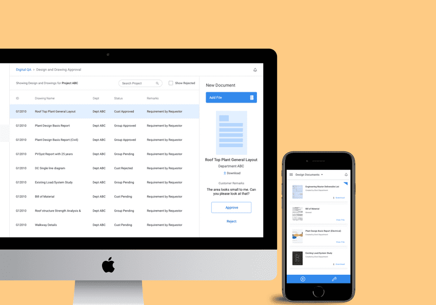
An application for GE to manage solar portfolio projects.
Why?
Managing solar installations at scale is hard as different aspects of a project are captured across isolated mediums like emails, spreadsheets and logbooks.
There is a lot of data to be recorded and monitored like equipment sourcing, design approvals, customer detail etc. Digital QA was designed to enable easier management of all this information.
Vision
We developed Digital QA to address three design goals -
- Allow GE stakeholders to acquire details easily on the go.
- Manage complex processes that are long due to approvals
- Track the status of requirements, materials and transactions.
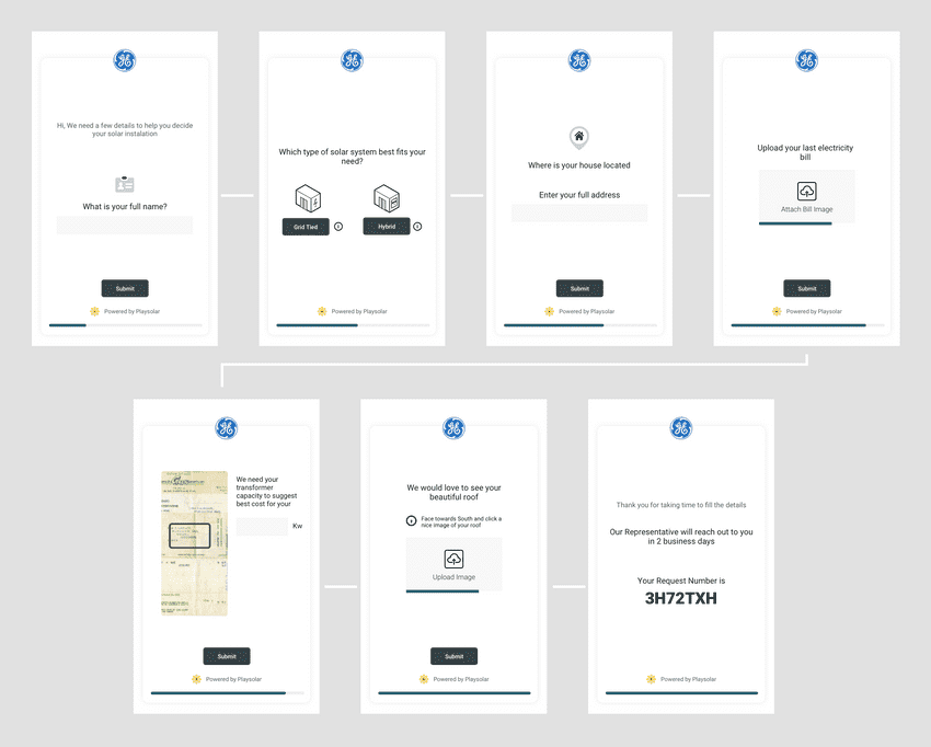
An example flow from the customer facing website
My role
- Discovery, Research, Wireframes, Visual Design, and Testing
Stakeholders
This was a complex project and had multiple stakeholders involved.
- GE Reps: Main administrators of the project who would track and manage the aspects of the project
- Playsolar Technicians: Site survey, design planning of solar panel installation and customer detail acquisition
- Customers: These could be individuals house owners or entire municipal authorities.
Research
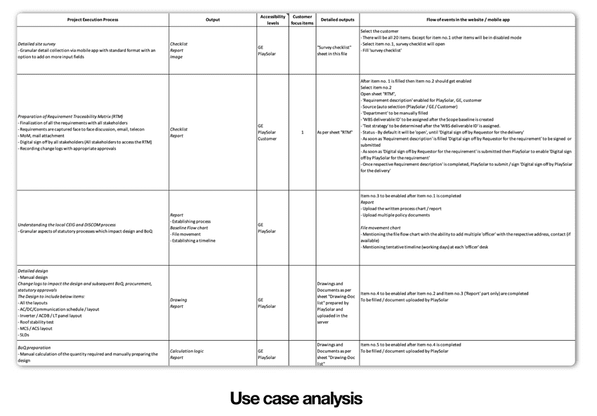
We conducted stakeholder interviews at the beginning as it was critical to understand the technical and business requirements of the project. The deliverable at this stage was a use-cases mapping.
Use cases mapping
The following screenshot captures the use cases document which detailed the goal, stakeholder involved and potential tasks for the apps and websites.
Key Insights
- The detail acquisition flows were overly complex and would intimidate customers.
- The users of the application were migrating from a spreadsheet-based workflow
- The process structure was too granular and could lead to cognitive overload
- Tracking and accountability have to be an ingredient for every user flow in the apps.
Opportunity
- Allow for product views to change with the different user roles.
- Utilize tabular views to allow easier migration of workflows.
- Reduce process complexity and group tasks in broader categories.
- Allow filtering, querying and reporting of data from all views.
Visual Design
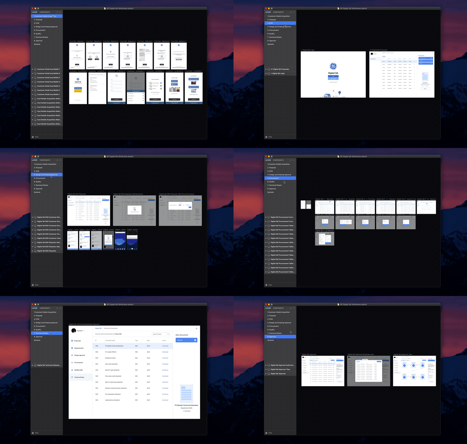
The entire visual design was done on Sketch and the core flows and interactions of the app were prototyped using InVision. As seen in the design file tour below, we landed on 8 core sections for the app which covered almost all possible use cases for all user roles.
Usability Evaluation
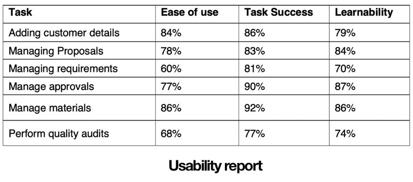
I conducted a fairly simple onsite system usability test. The purpose of the test was to assess the usability of the different tasks in the application, understand the learnability of interface, and task success metrics.
30 people participated in the Test. Each session lasted approximately 30 minutes. Test scenarios that were covered as shown in the image below. Overall, we received a very high ease of use and learnability rating for our interactions. Quality auditing and Requirement management flow yielded low scores.
Design highlights
Simple Relational Views
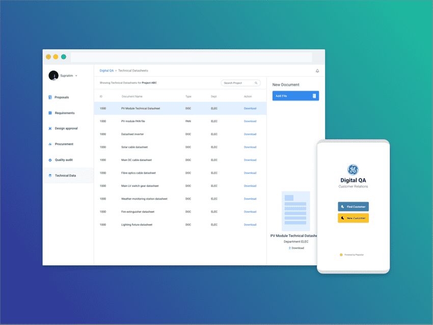
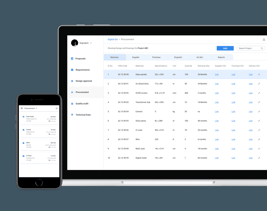
All tracking sections have a simple tabular structure that resembles a spreadsheet. The information is highly condensed down and each cell of these tables can act as links to other tables.
Taking action on items
Views that have an action associated with each row, display a right sidebar that shows primary and secondary action buttons. The customer view for the same section is condensed into a single action per row.
Simplifying complex views
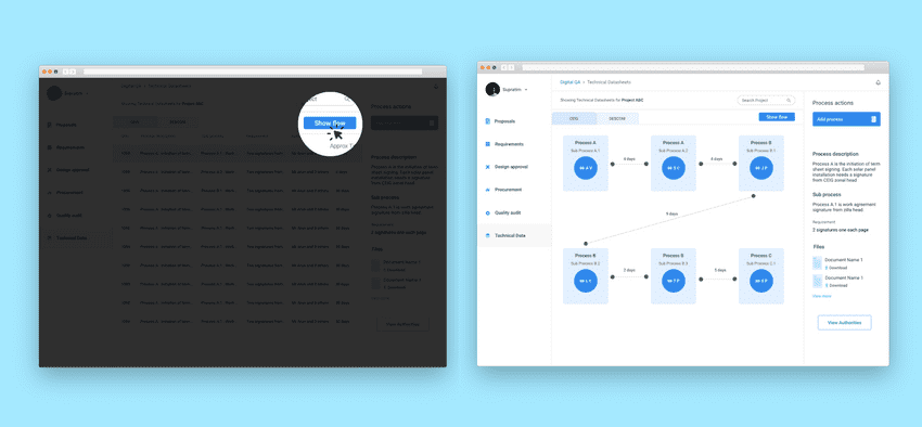
One of the tricker views was the process flow for approvals. Solar projects typically move slowly from one government authority to another and there was a strict need to understand this approval flow.
So we provided a view switcher to change a tabular display to a connected graph.
Outcome
This project was challenging due to the number of moving parts involved in each aspect. Stakeholder involvement at every step of the design was critical as missing a use case could mean a potential loss of huge revenue. From ideation to full visual design, the project took about a month to complete. My takeaways from the project:
Document everything
Getting in the habit of documentation is good and we should strive to document for the benefit of others and not just ourselves. With complex projects, they also become a big source of truth that everyone can depend on for validation purposes.
Respect user background
It's important to be considerate towards user background while designing, as this can help make transitions from old methods to your new design easier. Although usability evaluations might show poor metrics, it may be a result be of years of training in a specific workflow versus a new design.
Thank you for reading this case study. If you want to know more about the project, email me or reach me via twitter
