
Designing a PDF Viewer for the web
The Product
PDFOnline is a consumer-facing web product that competes with pdf utility websites like the ones you land on when you google “compress pdf”, ”pdf to image” etc. and most importantly Adobe web. The launch of pdfonline was particularly significant for the company and me as it was the first design-led product launch and was handled very differently from its severely engineering-focused launches of the past.
PDFOnline was built with two big goals
- Familiarize potential leads with our document SDK capabilities
- Become a central place for pdf productivity on the web - Think more like the Figma of the pdf world
Site Vitals
Post the launch of the website, without any marketing push and only through SEO and organic usage, we started growing traffic and impressions to the page. Our crop tool and PDF to PDF/A tools started ranking high. Our crop tool saw great growth due to additional advanced crop functionalities available on our website and our pdf/a format tools got a lot of traction as the format found a lot of use in Italian and Indian government processes. PDF/A file verification was therefore surprisingly popular in these 2 countries.

The website in its current form, is a collection of single-use tools where you enter the tool through organic web searches - land on the tool, process your file and then exit after saving the file to your local machine.

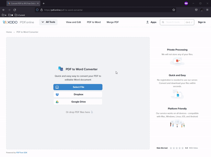
PDFonline Home page
Revised Goal
All of this growth was great but we were missing the key business goal - Become a centralized place for PDF productivity and showcase the power of our SDK for funnelling purposes. The biggest roadblock was our severe user retention issue. Our returning visitor count was 4%.
The worry with this is - you can easily burn through traffic acquisition sources and SEO can only go so far to help the situation. We had to make sure our efforts were being directed to increase user stickiness. Therefore we came up with a plan. To drive engagement & grow market share, we had to make pdf.online the center of user productivity which means becoming part of their day-to-day document experience.
a. Make efforts to replace browser pdf reader and viewer b. Couple single-use tools with a desktop-grade pdf editing and annotation experience.
So the design team came up with a 2 step solution to this:
- Create a browser to pdf viewer user flows.
- Come up with a Viewer/Editor experience for web
PDF Viewer Journey

Snapshot of keyword traffic
First Version
Our very first quick decision was to add some form of PDF Viewing functionality where most of the traffic exists. The download page of all our converter tools. We started our test by introducing a very subtle feature to quickly view the resulting files on the final page of these conversion flows.
Quick View for resulting PDF files
V2 - Quick Viewer
The uptick in viewer usage was barely significant, with such a subtle placement and no obvious way to view the file, that was bound to happen and we knew this going into the design discovery for the same. We quickly fixed this and added the quick view to the download sub-menu as 80% user screen activity on this page was on the download button and the associated sub-menu.

Quick View in Sub-menu
We later found the click events on 'open' were barely anything. A big factor we discounted was the fact that 43% of usage of pdf conversion was with more than one input file and engineering made the logical choice to hide the quick view option by default as it doesn't work for a group of files

Quick View absent with more than 1 input files
V3 - A separate Viewer
Finally, we had to conclude that the PDF Viewer has to be a separate action and we need to make sure people can discover this new isolated Viewer Experience from other sources of traffic. The bounce rate for the download/result pages on our convertor tools was very high because people just come in and out of these pages to just get their work done. Trying to create stickiness with those sets of users was time-consuming for the moment so we ideated an isolated document viewer

Isolated Simple Viewer
V4 - A need for advanced tools
We ran this internal build through our hotlist which is our early access focus group comprising DIY Notebook Community members, legal firms and the academic community. The common complaint was the lack of any kind of page manipulation like shape annotations, redaction and crop. We analyzed this request and went back to our competitive audit. Turns out almost every single player in the online pdf-viewer market is offering a barebones toolset and our pdf consumers like legal firms and the academic community is mostly looking for advanced tools like region annotation, and redaction of pdf text and powerful crop experience.
Therefore a lite-toolset viewer wouldn't cut it. The big hurdle to overcome was to ideate and form a viewer toolbar that has advanced capabilities and which made sense to our power user demographic. Our first attempt was creating a one-line toolbar with a simple set of advanced tools laid out in a horizontal fashion

PDFOnline Single Line Toolbar
V5 - Better Viewer Toolbar
We very soon realized that our product team had already planned for 5 new tools to be added in the year and this linearly growing toolbar was not scalable at all. We had to look for a categorized toolset organization and our easiest solution was reusing the categorization in our Xodo Mobile apps. The porting of that categorization over to a desktop-style layout with a two-line toolbar was not a difficult task.
It had a sensible hierarchy and effective categorization that worked well and we didn't have to redo any work here.

Xodo Toolbar organization influenced our two line toolbar
V6 - More Contextual Information
We did a very small internal prototype evaluation for the new viewer workflow and we noticed that people were having a hard time finding a way to localize which file they were working on. There was a lack of contextual information about which file were they working on. So we reduced the right sidebar horizontal footprint to give the viewer a bit more space and added metadata relevant to the file in the sidebar with the ability to change the file as well.

File information in sidebar
V7 - Focusing on discoverability
As a business key result, it was important to make sure the user was also discovering the other single-purpose tools on the website. For us, the retention metric was crucial. We had to find a way to make users have discovery funnels for the other packaged workflows.
We iterated on the sidebar approach to surface some other relevant tools which we called continuous actions.

Continuous Actions V1
V8 - More Improvements to the sidebar
Our first version was a basic idea to surface only the top 3 relevant actions. However, leadership was not happy with this decision as they wanted the discoverability to be as broad as possible and should be scalable to accommodate any number of tools. We then moved to a vertical scrolling list of actions and recommended the product team remove the rating and review component as this was added purely for SEO purposes and was utilizing critical space here.

Vertical scrolling list of Actions
The vertical list sounded great but it needed some organizational work. This list was supposed to show only relevant actions but for the majority of use cases which involved PDF files, almost all tools on the websites were applicable and therefore when everything on the website showed up on that sidebar, it becomes an overwhelming affair to go through.

Categorized list of Actions
Final Viewer Design
Of course, this being a document viewer, our visual footprint of the viewer area was so expansive that we had to come up with a way for the user to focus on their document experience as and when they required it. The quick solution we implemented was a simple expand and collapse interaction for the sidebar.

Hiding Sidebar
Integrating with day-to-day PDF Workflow
With this, we landed on a stable design for the document viewer/editor but we hadn't tackled the traffic acquisition part for this new flow yet. How does a user go from their day-to-day document consumption on the web to using our pdf viewer?
just to recollect, the design team had a two-step solution to this:
- Come up with a Viewer/Editor experience for web
- Create the browser to pdf viewer user flows.
Chrome Extension
Our initial market analysis led us in the direction of browser extension APIs that might allow you to replace a browser native pdf reader. In a perfect world, once you would install this extension, you would go about doing your daily workflow - landing on pdf files at various points and just opening them magically in our viewer instead of the browser.
Once a user adds the extension, we ask them if they want to replace the viewer and if the user decides to ignore the message then we do it only once more when once the user loads any pdf file in their browser post installation.

Prompt to replace browser viewer
If the user denies that as well, we get a double signal about their interest in only the quick pdf actions feature which simply puts a list of quick access links in the extension menu to do popular pdf manipulations like compress, merge, pdf to image etc

Extension menu for quick links
A big failure
As soon as you open a pdf file from anywhere on the web, theoretically, our new viewer should come up instead of that browser viewer and we even pushed for removing the top navigation from the design to make more room for the document reading experience which we couldn't do on the website.
Once the chrome extension got released, we started noticing a lot of errors where the extension was unable to load certain files. We decided to do a band-aid solution to the problem by adding an error modal that gave the user an option to open the file in the browser reader instead.

Error modal for files we couldnt load in extension
But those file loading errors just started mounting. We diagnosed that we were unable to load certain pdfs due to a technical constraint. Any pdf that was dynamically loaded e.g. from an email attachment or via google drive, we were not able to parse and load in our web viewer. This was a failed launch. In hindsight, this could have been avoided if the technical discovery phase was given more time and we had a better idea about the limitations.
Final release
So it was time we attacked the problem right where the pain point was, opening pdf files from Gmail & google drive, the use case that we completely ignored. We focused on the google ecosystem only as the usage numbers for Gmail and drive far topped anything else on our plate.

Google Workspace Marketplace
By listing on Google Marketplace, our application will have the potential to reach over five million businesses using Google Workspace. Launching on a platform with an existing user base of 5 million +, will give a head start to growing market share and funnelling users into our platform.
So we reworked our business strategy
Objective:
- Target businesses & individuals with heavy pdf workflows,
- Build a gsuite app with gmail & gdrive integration
- Become a center for pdf-related user productivity
KR:
- Increase user retention to 15% by Q4 2022
As for design deliverables for this Gsuite release:
- A way to open a google drive file in our viewer
- A save to google drive workflow
For opening the file, we already had google drive as a source in the file picker so it was a simple workflow, to be honest. Click connect google account, pick a file

Google Drive as File Source
The tricky part was integrating a save/save as/download workflow. As you can see in the image below we just had download and save as in the menu till now. However, we ran into the struggle of a very unoptimized workflow with cloud storage files. The immediate feedback from our V1 release on the marketplace was people were not keen on selecting a file from google drive, working on it, and then download a copy to their system. They just wanted to save it back to the original google drive file.

Download Menu for Gsuite release didn't work
So our broad idea of picking a file, working on it, and then downloading the file doesn't work when you select a file from google drive.

Simplified Save Button CTA for Gdrive files
And with that we are finally where we are today - Our pdf view/edit experience on the web as of May 2022, is sitting at 120K organic site visits for view/edit flow.