Improving navigation and medicine page architecture.
Why?
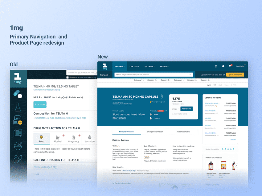
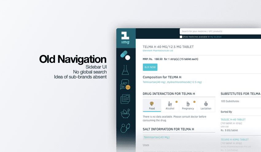
The old navigation component of 1mg was a left sidebar with big icons that represented different services. This design didn't represent hierarchy across the various verticals.
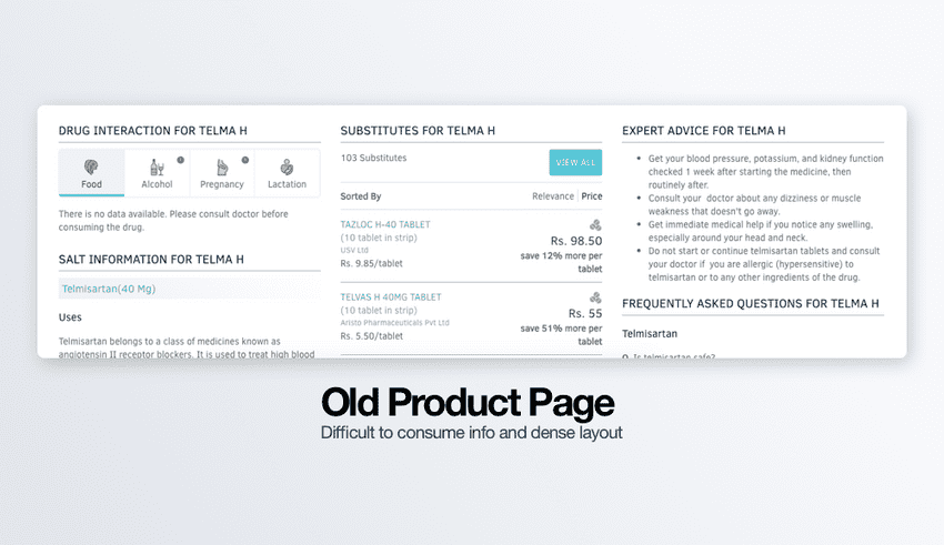
Old product page only catered to information consumers. Transactional items like add to cart, product comparisons, etc. were missing and the presentation of medical data was dense.
Vision
The navigation redesign served 3 goals:
- Showcase services as sub-brands.
- Clear navigation flow that captures hierarchy.
- Modular components for future changes.
The product page redesign also had 3 goals:
- Restructure critical drug information.
- Separate business and medical information.
- Upsell content from other services.
My role
- Research, Ideation, Information Architecture and Visual design
Research
We utilized 6 sources of information for our research:
- Data team: Provided us with analytics and funnels for pages. This helped analyze the type of users and their expectations. They also helped in mapping priority of all page elements.
- Doctors team: They provided legal background about medical content and identified critical drug information.
- Product Team: A previous grounded study with long-term users also validated some assumptions.
- Leadership: the business goal was to unify the brand image of 1mg services and increase transactions.
- User Interview: We interviewed 15 users of which 10 were patients, 3 were Pharmacists and 2 doctors.
- Survey: We also sent out a questionnaire survey which received 800 responses.
Key insights
- Only 5% of users questioned side effects info on our site. Users trust our content.
- A majority felt drug to drug interaction information is important.
- The brand attachment for specific drugs is due to user trust in doctor's prescriptions.
- FAQs are not that important as doctors provide answers while giving out medicine.
- Pharmacists suggested patients should verify information online with current research.
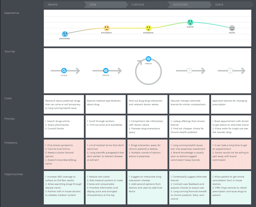
1mg Customer Journey Map for searching prescription meds
Opportunity
- Improve discoverability of services like Labs which has < 10% traffic
- Visually and logically differentiate between services.
- Market differentiation with comprehensive medical data coupled with improved presentation
- Engaging the audience and improving retention.
- Improve SEO by structuring page content.
Wireframing
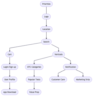
Before our wireframing process, we proceeded with content audits for our existing header design and product page design. This was to help us with assigning priorities across different elements of the design.
Here is an example of the content audit for the new 1mg header
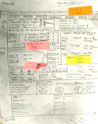
The very first low fidelity wireframes resulted in the idea of a medicine card at the top of the product page. This would contain critical medical information and would also have the transactional CTA.
Lo-fi Wireframe for Product page
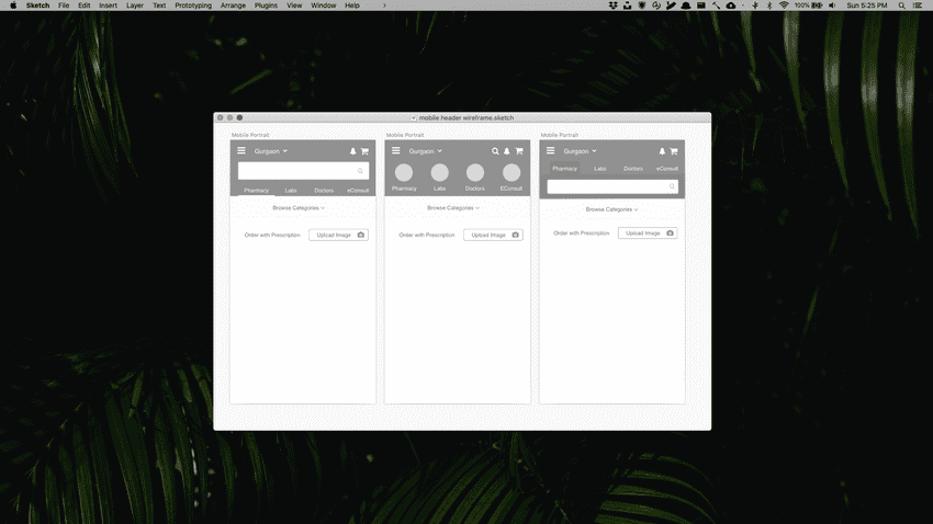
We tried a lot of ideas for the header design on mobile. A few that stood out are presented here. We finally went with the rightmost idea as it presented the hierarchy best and faired best in our guerilla usability test.
Wireframe for mobile header design
Visual Design highlights
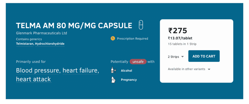
Medicine Card
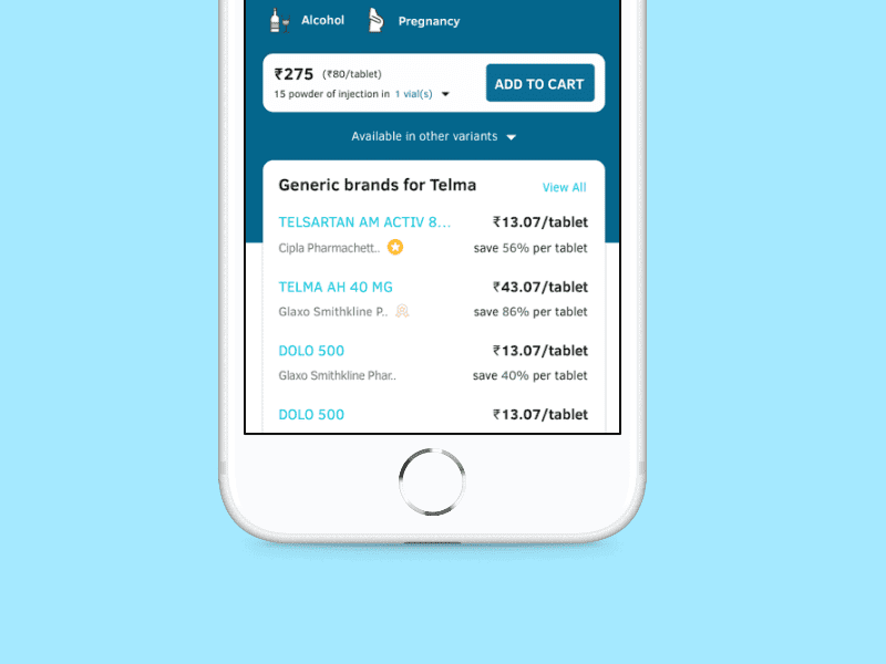
The previous product page design had all medical information but it was hidden between lengthy blocks of text. In the new design, critical drug information is surfaced at the top and is instantly consumable. It also displays critical warnings, the primary use of the drug, the CTA to add the product to cart.
Brand Substitutes
Doctors keep prescribing drugs from specific brands that pay them commissions. This allows the manufacturer to mark up their prices due to high demand. Our goal with this design element was to highlight alternatives and visually recommend some variants to people.
Header Design
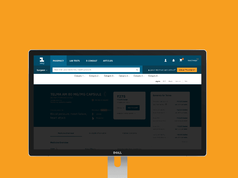
The first level in the multi-tab layout represented our core services. The search bar on the second level would be consistent across services. Any future service addition would be added as a first-level component and the cta and marketing section can be edited accordingly.
Outcome
This project carries a special place in my heart as it was the first time I worked on the critical business-facing interaction points of the product. It could never have been possible without the endless support of my colleagues at 1mg. The company culture at 1mg allows free form exploration of design ideas and is not strict on process adherence. We followed a semi-formal sprint model for working on this and it took about a month to get into production. My takeaways from the project:
Collaboration is key
Without the valuable inputs from so many verticals of the company, our research could never have been this thorough. Tunnel vision is real and sometimes is just an absolute lack of perspective which needs validation at every stage for a project of such scale.
Fighting for ethical business
I learnt about value systems that respect the focus, task, and time of the user. I realized that design shouldn't exploit user attention to allow incessant marketing to hamper customer experience. Contextual upselling is possible and can be done by making sure it's available to those who truly need it.
Thank you for reading this case study. If you want to know more about the project, email me or reach me via twitter
