Abstract
Today, designers need to iterate over their mocks and this involves a cycle of referencing other style guides and adapting it to own use cases over a long period of time. Personal preferences and intuition cannot enable complete automation of this interface design process. One way of overcoming this problem is enabling faster design adaptation tooling. A system that designers can use to reference and adapt designs at a rapid pace.
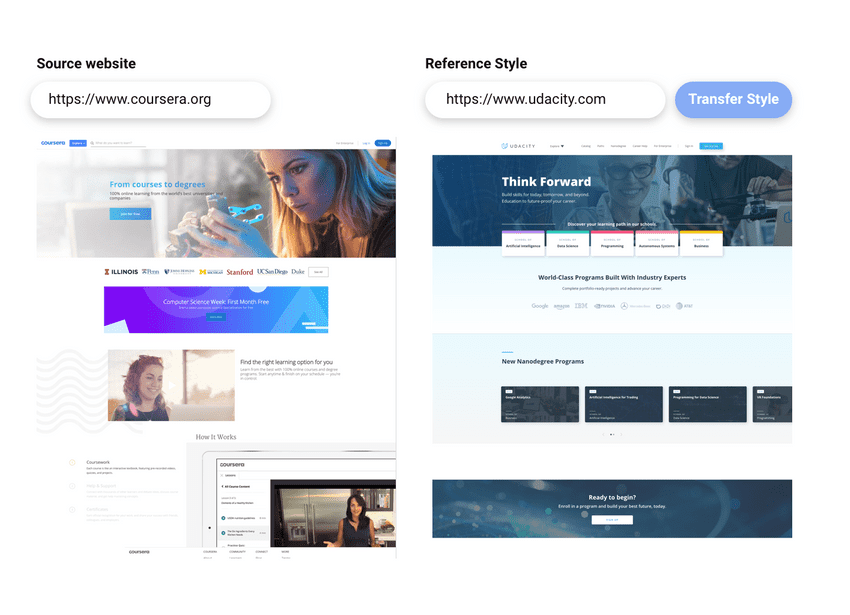
In this research project, I explore the research design process, implementation and preliminary evaluation of a website design style transfer system called Exidesign. The system allows selection of a reference website design and a target design. The output will be a website with content and components from the source website shown in the target website's style. The referenced components of style are typography, layout and image styling.
Introduction
The traditional process of designing a website begins with the brainstorming and ideation phase. This process requires the designers to reference inspiring examples and generate a creative seed for their own design. This is a time-consuming step where the designer is using cues from existing website styles to generate his/her own visual language. The reference styles might be unique in their nature of handling either navigation, typography, layout or specific element styling. To fully test this reference design with its own content, designers have to go down to the CSS and Markup code to understand the implementation.
Automatically creating entire designs can lead to conflicts with a designer's personal preferences. A controlled environment of a traditional design tool like Sketch does exercise the preferences better. But, an ideation and referencing automation process can help surface different styles with the core content remaining the same. Our tool, Exidesign, facilitates this through style transfer. The user inputs one source website and one reference website into the tool. The system then transfers content from the source website and shows it in the target website's style. The components of the website considered in the style transfer are layout, navigation, typography and images
The underlying architecture of the tool optimizes a component match between source and target designs. We use a set of visual and semantic and relationship cost features to determine a good component to component match between two given websites. The final mappings between source and target websites produced use a single layer perceptron with the trained weights to optimize the visual, structural and semantic cost.
The primary research goal of this tool is to test the system's capability to reduce time taken to ideate website designs. Unlike parametric design tooling (Jabi, 2013). Work here is for improving referencing and adaptation workflows for interface design. Second, is to explore how modularized design component references can generate good design inspirations. This is to do with the qualitative aspect of dealing with more than one references for style transfer. A qualitative evaluation of the generated design will give valuable feedback on the output design the tool generates.
Figure 1: Interface of Exidesign with controls for specifying source and target websites
Related work
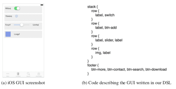
Pix2Code(Beltramelli, 2017), is a system that uses convolutional neural networks to generate usable front end code from an interface screenshot. The system uses a CNN to perform unsupervised feature learning for mapping the raw input image to its feature representation. A recurrent neural network takes the textual feature description of the image to create a DSL (Domain specific language) representation. The DSL (See Figure 2) is then passed through platform specific convertors that takes the DSL representation and transform it into UI code for specific platforms. XML layout for android and swift storyboards for iOS.
Figure 2: GUI and DSL in Pix2Code
Webzeigeist (R Kumar, Satyanarayan, & Torres, 2013) is a design repository that crawls visual and semantic features of websites. The authors developed a system for mining design data of websites at a large scale. The result was a repository of 100000 web pages elements and their characteristic attributes. The data comprised of the document object model for each page along with a set of semantic and visual features that described the page. They seprarated the CSS and image assets for third-party developers to access modular components of each design through their public API. They also processed and stored the visual segmentation of the websites and calculated some derived features like page node counts, a histogram of gradients for the images etc. Beagle (Battle et al., 2018) similarly tried to crawl and label interactive visualizations in webpages. Their research contribution is to find what visualizations are prevalent in website designs as well as what category of visualization idioms best suit a given task.
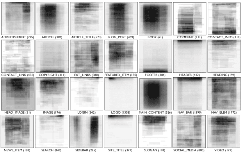
Outside visual features, Lim et al tried to understand the structural semantics for the web (M. Lim et al., 2012). They used a large collection of manually labelled page elements to train a support vector machine. Using this, they were able to give render time structural semantics of any webpage. You can see the example in Figure 3.
Figure 3: Structural semantics of pages
A strong motivation for building a design tool that assists in building off from reference designs is the speed and utility it provides to novices and experts alike. Lee et.al present a qualitative study to explore whether people can realize significant value by designing through example modification (Lee, Srivastava, Kumar, Brafman, & Klemmer, 2010). They found that people preferred designs created with the aid of examples and users prefer adaptively selected examples to random ones. They also concluded that users make use of examples when creating new designs. Prior studies also reveal that users generate diverse ideas when presented with diverse examples beforehand and generate more creative ideas if shown creative examples pre-evaluation (Siangliulue, Arnold, Gajos, & Dow, 2015).
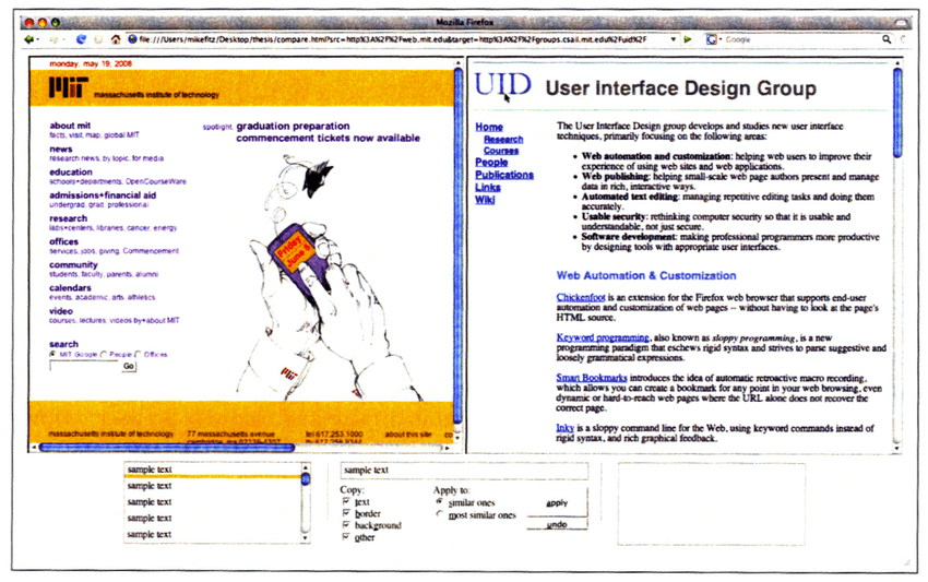
The first kind of website style transfer is user-controlled and manual. CopyStyler (Fitzgerald, Michael J., 2008) is an example of such a user-driven browser-based tool that allows novices to have two webpages side by side for copying CSS styles between them. It used a browser extension to provide an in-browser GUI. This was a manual process of selecting source and target for transferring the CSS styling. Our tool removes the need to do any such manual transfer.
Figure 4: Interface of CopyStyler
Unlike manually initiated style transfer, design tools can also suggest refinements passively. DesignScape (O'Donovan, Agarwala, & Hertzmann, 2015) is a system that aids the novice users by suggesting layout refinements in their design. The tool provides two kinds of suggestions. First, simple refinements that improve the current structure of the design. Second, changes that reposition components on the fly as the user continues to add elements to the page. In a similar vein, SUPPLE(Gajos, 2006) presents automatic interface generation for cases when device constraints and end-user characteristics are not unknown. It searches for the interface that best matches the device constraints and target user properties. The search uses a declarative description of the device characteristics and the user and device-specific cost function to generate the interface. User traces of system usage is also used to improve the interface transitions as the system matures. Another recent contribution to automatically generate interface is Brassau(Fischer, Campagna, Xu, & Lam, 2018). A design tool that converts natural voice commands into the appropriate GUI.
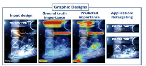
Instead of generating or suggesting entire interfaces, existing publicly available data can help improve portions of the entire design. Like font pairing between different sections of the document. Automatic font pairing (Jiang, Wang, Hertzmann, Jin, & Fu, 2018) through the use of a corpus of knowledge on visually pleasing font combinations helps suggest interface variations as well. Jiang et al. use k-NN and an asymmetric similarity metric to learn the visual relationships between fonts. Apart from fonts, the spatial, visual and structural attributes of all components, also play a role in deciding the importance of the design. Training a neural network on the human-annotated importance of components has shown progress in predicting the value of graphic design (Bylinskii et al., 2017). The authors claim such prediction about the order of value of different components in a design can help with automatic retargeting of layouts. (See Figure 5)
Figure 5: Heatmap of importance in a design
Use of the attributes of design components can improve browsing of example designs. Style based search(Bhardwaj, n.d.) uses recurrent neural networks to train a network on captured style attributes of web pages and then backpropagates the learned system parameters to make style based search possible. With the help of the learned parameters, the system allows for example-based querying for designs in a digital gallery. An example query being browsing webpages that have 3 columns and a big hero image. This kind of querying is not possible in traditional text-based search engines. In some situations, the organized attributes of reference design are not available in an actionable format. Like a flattened bitmap or raster screenshot. In this case, expert users, in particular, recreate the reference design in an interface designing tool, to reuse parts of the reference design in their creations. Rewire is an interactive system that allows designers to convert screenshots into usable vector designs (Swearngin et al., 2018). They convert each component in the raster screenshot into an editable vector representation. They test the system by integrating it with UI design tools and comparing it with using examples without any help. A real-time example-based help while designing can steer designers to create a visually pleasing interface. An example of such a tool is Sketchplorer (Todi, Weir, & Oulasvirta, 2016). A real-time layout optimizer that infers the designers intended action and performs local optimization to improve the final layout. It uses a predictive model of sensorimotor performance and perception to perform these optimizations.
Understanding the attributes and components which contribute to visual significance in webpage design is a complex task. This is because modern web documents have a deeply nested and complex hierarchical structure. Ply (S. Lim, Hibschman, Zhang, & O'Rourke, 2018) tries to tackle this problem by using visual relevance testing, a technique to identify the properties which have a visual effect on the page. It hides irrelevant CSS code and presents relationships between the attributes.
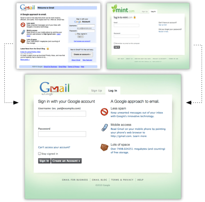
The most important component of style transfer in website design is the layout and structure transfer. Bricolage algorithm (Ranjitha Kumar, Talton, Ahmad, & Klemmer, 2011) uses structured- prediction to create coherent mappings between pages by training on human-generated mappings (See Figure 6). The main contribution is using ancestry and sibling relationships in computing the cost of each source-target node pair. The system directly transfers the innerHTML of the source node to the target node. This presents some rendering issues like text overflowing and visual artifacts in the positioning of content. In Exidesign, we overcome this issue by sanitizing content according to the virtual DOM constraints of the target node. We focus on text, link and image tags thereby preventing inconsistent tag matches.
Figure 6: Bricolage in action
Layout matching and inferencing in interfaces have extensive literature. Layout inferencing when components use absolute positioning can be useful if represented as a managed layout with views and components in a hierarchical structure. This makes porting of views based on different configurations easy (Ramón, Cuadrado, Molina, & Vanderdonckt, 2016). Familiariser (Todi, Jokinen, Luyten, Oulasvirta, & Fi, 2018) is a browser-based tool that reorganizes the layout of a page based on the historical pattern of interacting with different pages by a user. It uses concepts of familiarization used by the human visual system. The idea is to present to a user, a familiar-looking layout for any new design they encounter.
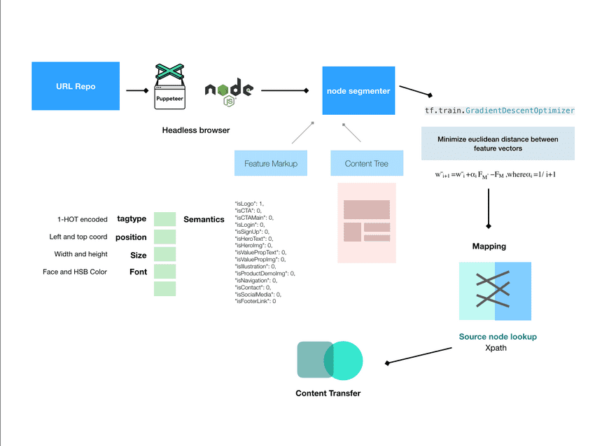
Figure 7: System architecture of Exidesign
System Overview
The Exidesign architecture has 3 main components to it.
- Data Collection which includes page segmentation and feature markup
- The single-layer perceptron learning stack where we reduce our visual and semantic costs.
- Reconstruction of DOM with output mappings from step 2 to transfer content between pages.
Data Markup
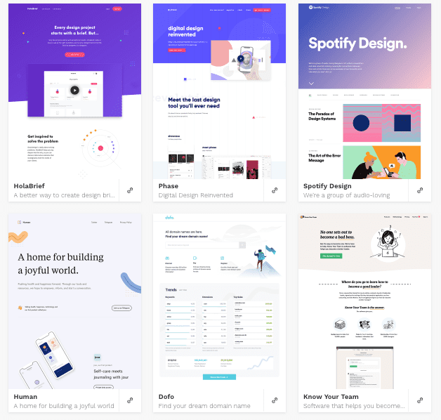
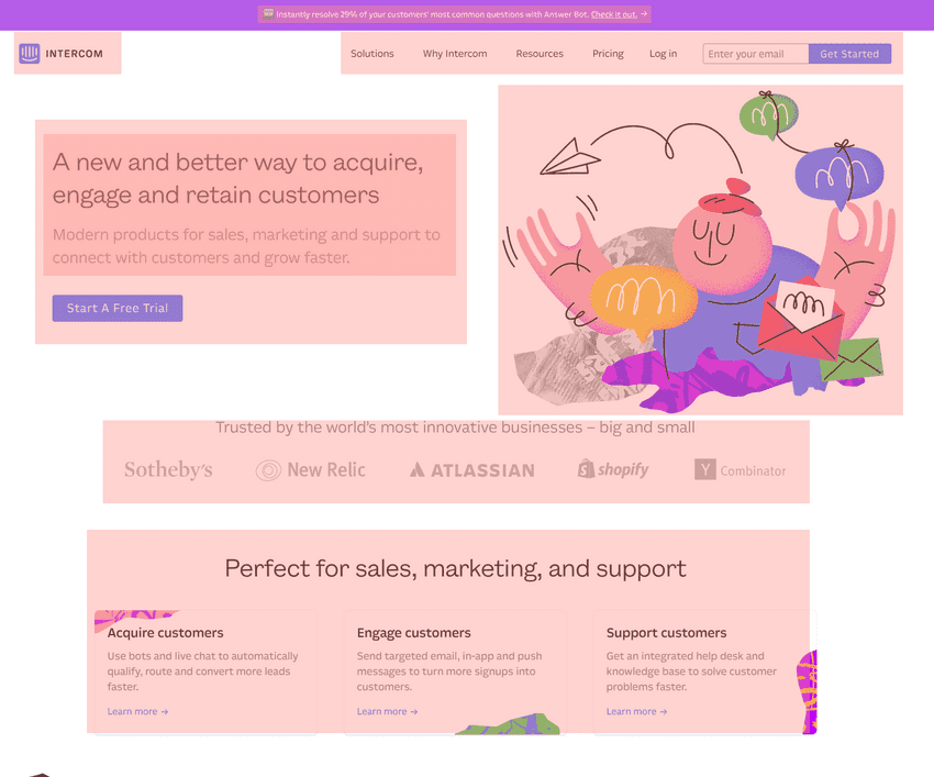
To build the dataset, we use puppeteer, a NodeJS library that allows running the Chrome headless or in other words, without GUI. The library provides a high-level API for controlling any web content shown in a browser. It provides event listeners for content loading in the DOM and allows DOM processing through injected JavaScript scripts. We configured Puppeteer to run with a viewport of 1920 by 1080 and bypassed Content Security Policy as that interfered with the loading of remote assets and images in our pages. The standard flavour of jQuery was also attached to every page we navigated for use in DOM object manipulation. We used the NodeJS API for reading files from the filesystem and to load a text file with a list of line separated URLs. The list comprised of landing pages of some popular websites to constrain web content to be static. Apart from landing pages of popular internet services and digital products, we also crawled a set of 100 aesthetically designed homepages from gallery websites (see Figure 8). The selection criteria for choosing the webpages were -- Clear textual elements, bold and diverse imagery, simple navigation elements and a simple visual structure to elements on the page.
The node segmentation begins with puppeteer passing the window, document and root node information to our segmentation logic. Our webpage segmentation takes ideas from Block-o-Matic (Sanoja & Gancarski, 2014). The high-level working of the system is as follows. We parse the DOM tree for valid content elements, which includes a series of HTML tags that contribute to the content on a page. IMG, A, LI, DT, DD, <H1-H5>, P are example of such tags. We ignore tags like HTML, SCRIPT and LINK as they do not contribute to any visual content on screen. Tags that have the CSS property "display: none" stay hidden on the page.
Figure 8: Gallery of landing pages from lapa.ninja
Post this, we sanitize the content-container relations. This is because all modern HTML pages have deeply nested container tags that might not contribute to a content's actual container. Also, we reorganize any content that is within 40 px of each other under one parent. They get sub-contained into one logical container (See Figure 9). The logical sanitized tree is then processed in-order for attribute information. First, we filter and parse all the link nodes, then the image nodes and then all text nodes. The set of visual features we process for each node is common across the tree. The visual features include viewport coordinates, width and height, font size and font weight, font colour separated into the average R, G, B and alpha values. We use the computed style attributes in the page window information passed by Puppeteer to capture property values of a node. We use jQuery offset, and height and width functions to extract position and size information. For capturing the text nodes, we use the DOM text nodes filter as it proved much faster than manually scraping text elements. For every link node, we extracted its text content separately while parsing links and marked each link node as visited. This allowed for ignoring elements whose parents were link tags while extracting text nodes. For processing image nodes, we decided to exclude SVG path tags as comparing vector image elements to raster elements was not in the decided scope of this work. The URL to the image source was also captured by the value of the property src. The caveats to this were tags with images in the form of background-image and srcset. We handled those separately.
Figure 9: Example of the web page segmentation
Some of the structural features we captured were tag type, numerical and in page positional identifiers. For a unique reference to the element location on the page, we used their XPath reference as identifiers. XPath is a querying format representation for selecting and identifying nodes in any XML and XML-like documents. In the same vein, the XPath of their parent container is also captured. For a numerical unique identity for each node, we use an MD5 hashed output of their XPath. Each URL processed has its nodes and their attributes stored in a JSON representation in the file system. We use MongoDB for easy JSON storage.
Apart from the visual and structural attributes, we worked on an information capturing interface that collects design-related semantic features of every node (See Figure 10). The interface uses a Chrome extension that iterated through our segmented nodes. It prompted the user using our capturing interface, to categorize each element into its most fitting role on the page. After iterating, we settled on the following semantic categories. Logo, Primary Call to Action (CTA), Secondary CTA, Login, Header, Hero text, Hero image, Value proposition, Illustration, Product showcase, Navigation, Contact information, Social media, Footer link. There can be further categorization possible, but we found that the above categories best fit our initial set of landing pages processed. The capturing interface in its current state iterates through all nodes in the page sequentially. Batches and larger in-the-wild delegation can speed up this process. This kind of nuanced semantic categorization of elements helps improve the matching results of our perceptron. We understand that we can also adopt a more rule-based categorization for our nodes and decrease the mechanical effort needed. E.g. link tags in the top 1% of the page can be automatically classified as header navigation. Explicit human annotation of nodes allows for superior categorization and can contribute to much better matching of nodes while training our perceptron. The semantic taxonomy we used borrows terms from design and web development vocabulary. These terms best represent the utility and role of individual components of a webpage.
Figure 10: Information capturing inteface for semantic categorization of nodes
For training our perceptron we recorded node mappings between 20 pairs of webpages marked by a human. The criterion for selecting the annotator was a basic level of familiarity with web design. This mapping used the mapping annotation tool built using puppeteer and NodeJS. The mapping tool used puppeteer to pick any two URLs from the list on separate tabs. A red overlay marked each element. We used their top and left position and its width and height to draw the red overlay. The numerical id was also rendered on top of the boxes for easy identification. The tool iterated through all nodes on the first page and asked for a user input about the corresponding matching node on the other page. The input mechanism is a dropdown list with numerical ids and a no-match case. A mouse-driven side by side view interaction can greatly improve the process of matching nodes. We recorded the mappings as a set of node1, node2 pairs.
Learning Stack
We use all the visual, structural and semantic attributes captured for each node. We construct a feature vector for each node fn={fvisual,fstructural,fsemantic} where the TAG type is one-hot encoded. We scale the viewport position, and node size and width to be between 0 and 1. Semantic features represent the boolean indicators like isCTA, isHeroText etc. We construct a weight vector w that corresponds to each semantic feature in fn. All weights initialize with value of 0. At each epoch of the training, we match each node and its feature vector with the closest node in the target node collection. The cost metric we use is the Euclidean distance of the source node feature vector from the target node. We refer to each edge as e, corresponding to a node matched from source to target. The cost of each edge is ce=wFT-wFS, where w is the weight vector. The total cost CM of our generated mapping at each epoch of training is ∑ec where we sum up cost of each edge between source and target pages. The weights update at each stage by Wnext = Wcurr + αcurr(CHM-CM), where CHM is the total sum of edge cost in our human mappings between source and target website and αcurr is the current epoch learning rate. We chose an epoch range of 800 and averaged the learning rate in the last 10 epochs.
For implementing this perceptron, we used TensorFlow and utilized its gradient descent optimizer with a custom cost function as defined above.
Style Transfer
The output of the mapping process is a text file containing the pairs of numerical ids corresponding to the source and target website. We iterate through each pair and retrieve their content and computed styles from the MongoDB instance. The content of the text node is in the label attribute, for link nodes, the text is in label and URL is in the href attribute. For image nodes, we store the image source in the imgsrc attribute. For each pair in the computer mappings, we see the difference in tag type. If both nodes are similar tags, it's an easy content switch. For a non-image node, we overwrite source text on the target. For an image node, we carry forward the src, srcset and background-image properties. If the tags are different, e.g. a source node with a tag type as IMG and a target node with a tag type DIV. In these cases, we use the imgsrc as the background image value for the target node. To find the respective element corresponding to a node, we use the stored XPath reference to uniquely identify the element and then do the content switch. The other preprocessing, we do is render the text range that is within the bounding box of the target element so that we don't overflow the text. In cases where the text is larger than said width, we use CSS ellipsis on the text.
Style Transfer results
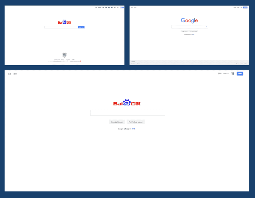
Figure 11: Source from baidu.com and style from www.google.com
We ran Exidesign on a testing pair of 10 websites and the example results showcase possibilities of the matching system. Figure 1 shows the simplest case of transferring the style across two popular search engine websites. The logo, top navigation links and primary call to action transfer nicely.
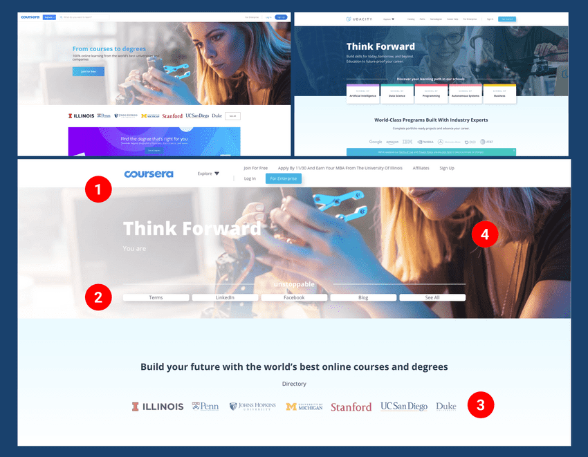
Figure 12: Content from www.coursera.org and style from www.udacity.com
Figure 2 shows more complex layouts. Style of udacity.com on coursera.org content. The highlights of this example are the big hero image transferred and boxed correct (See 4 in Figure 12). The logo (1) and card style links (2) also adapts nicely to the coursera logo and coursera navigation. The most interesting style transfer result is how the partner logos carried across the two websites. Two product landing pages with simple grid-based layout, one primary illustration and one block of hero text also had similar results.
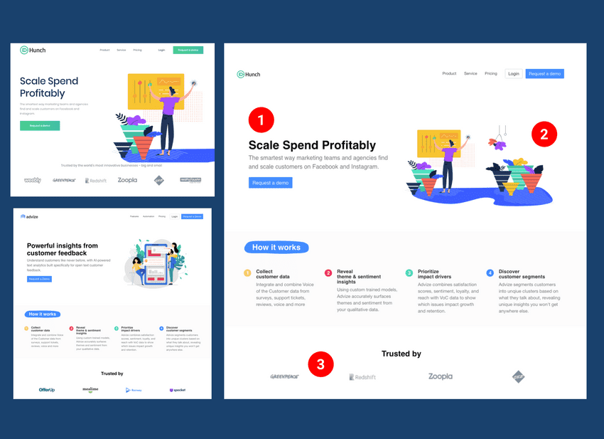
Figure 13: Content from hunchads.com and style from www.advize.ai
The illustrations (See 2 in Figure 13) managed to scale and the hero text (1) transferred to its correct corresponding node on the target page. Like our second example (Figure 12) the partner logo elements also matched.
References
- Battle, L., Duan, P., Miranda, Z., Mukusheva, D., Chang, R., & Stonebraker, M. (2018). Beagle: Automated Extraction and Interpretation of Visualizations from the Web. Proceedings of the 2018 CHI Conference on Human Factors in Computing Systems. https://doi.org/10.1145/3173574.3174168
- Beltramelli, T. (2017). pix2code: Generating Code from a Graphical User Interface Screenshot, 1--9. https://doi.org/10.1145/3220134.3220135
- Bhardwaj, A. (n.d.). Style Based Search Using RNN for Searching Web Design Gallery.
- Bylinskii, Z., Kim, N. W., O'Donovan, P., Alsheikh, S., Madan, S., Pfister, H., ... Hertzmann, A. (2017). Learning Visual Importance for Graphic Designs and Data Visualizations. https://doi.org/10.1145/3126594.3126653
- Fischer, M., Campagna, G., Xu, S., & Lam, M. S. (2018). Brassau. Proceedings of the 20th International Conference on Human-Computer Interaction with Mobile Devices and Services - MobileHCI '18, 1--12. https://doi.org/10.1145/3229434.3229481
- Fitzgerald, Michael J., M. E. M. I. of T. (2008). CopyStyler : Web design by example. Retrieved from https://dspace.mit.edu/handle/1721.1/46032
- Gajos, K. (2006). SUPPLE: Automatically Generating User Interfaces. IUI, 93--100. https://doi.org/10.1006/jssc.1998.8014
- Jiang, S., Wang, Z., Hertzmann, A., Jin, H., & Fu, Y. (2018). Visual Font Pairing, 14(8), 1--10. Retrieved from http://arxiv.org/abs/1811.08015
- Kumar, R., Satyanarayan, A., & Torres, C. (2013). Webzeitgeist: Design mining the web. Proceedings of the ..., 3083--3092. https://doi.org/10.1145/2470654.2466420
- Kumar, R., Talton, J. O., Ahmad, S., & Klemmer, S. R. (2011). Bricolage. Proceedings of the 2011 Annual Conference on Human Factors in Computing Systems - CHI '11, 2197. https://doi.org/10.1145/1978942.1979262
- Lee, B., Srivastava, S., Kumar, R., Brafman, R., & Klemmer, S. R. (2010). Designing with interactive example galleries. Proceedings of the 28th International Conference on Human Factors in Computing Systems - CHI '10, 2257. https://doi.org/10.1145/1753326.1753667
- Lim, M., Kumar, R., Satyanarayan, A., Torres, C., Talton, J. O., & Klemmer, S. R. (2012). Learning Structural Semantics for the Web. Tech. Rep. CSTR 2012-03. Stanford University.
- Lim, S., Hibschman, J., Zhang, H., & O'Rourke, E. (2018). Ply: A Visual Web Inspector for Learning from Professional Webpages. The 31st Annual ACM Symposium on User Interface Software and Technology, 991--1002. https://doi.org/10.1145/3242587.3242660
- O'Donovan, P., Agarwala, A., & Hertzmann, A. (2015). DesignScape. Proceedings of the 33rd Annual ACM Conference on Human Factors in Computing Systems - CHI '15, 1221--1224. https://doi.org/10.1145/2702123.2702149
- Ramón, Ó. S., Cuadrado, J. S., Molina, J. G., & Vanderdonckt, J. (2016). A layout inference algorithm for graphical user interfaces. Information and Software Technology, 70, 155--175. https://doi.org/10.1016/j.infsof.2015.10.005
- Sanoja, A., & Gancarski, S. (2014). Block-o-Matic: A web page segmentation framework. International Conference on Multimedia Computing and Systems -Proceedings, 0(April), 595--600. https://doi.org/10.1109/ICMCS.2014.6911249
- Siangliulue, P., Arnold, K. C., Gajos, K. Z., & Dow, S. P. (2015). Toward collaborative ideation at scale - leveraging ideas from others to generate more creative and diverse Ideas. Proceedings of the ACM Conference on Computer Supported Cooperative Work & Social Computing, 937--945. https://doi.org/10.1145/2675133.2675239
- Swearngin, A., Dontcheva, M., Li, W., Brandt, J., Dixon, M., & Ko, A. J. (2018). Rewire: Interface Design Assistance from Examples. Proc. of CHI, 1--12. https://doi.org/10.1145/3173574.3174078
- Todi, K., Jokinen, J., Luyten, K., Oulasvirta, A., & Fi, A. O. (2018). Familiarisation: Restructuring Layouts with Visual Learning Models. Proceeding IUI '18 23rd International Conference on Intelligent User Interface. https://doi.org/10.1145/3172944.3172949
- Todi, K., Weir, D., & Oulasvirta, A. (2016). Sketchplore: Sketch and Explore with a Layout Optimiser. Proceedings of the 2016 ACM Conference on Designing Interactive Systems - DIS '16, 543--555. https://doi.org/10.1145/2901790.2901817
