I have always been a little curious about visual communication through hoardings, banners and bulletin boards. Being in a culturally diverse metropolitan like Vancouver. I wanted to make some observations on traditional community bulletin boards located in public spaces to learn more about how people socially interact through and with this cultural artifact.
From our observation in the field sampling the large number of boards and their postings. We find two extremes in physical board design.
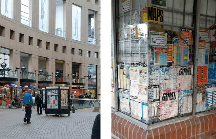
The first being, strategically designed bulletin boards like the ones installed at the Vancouver Public Library. Situated at the center of the main entry space. The institute handles the boards and provides individuals and organizations, a space to display relevant permissible content. The space grant is for a 3-week term. Also, to put up any notice, you require a written permission letter signed by library authority.
The second are ad-hoc postings. For example, the bulletin board space provided by glass walls of a currency exchange shop located in any Gas Town alleyway. These are advertisements or event annoucements from small businesses and service providers. No management body looks after these posters.
Findings
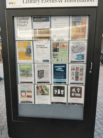
Posting Variety: A single board inside Vancouver Public Library displayed an array of 24 postings with 7 personal advertisements, 3 library administration notices, 4 social and community event invitations, 2 educational pamphlets, 2 recreational reading fairs, 2 cultural show information posters,2 posters on government initiatives and 2 library maintenance notices about food and drinks inside premises
A randomly picked wall from the Gas Town shop walls contained 12 postings. There was a single administrative notice, one cultural show notification, 2 repeated business advertisements and 8 personal advertisements.
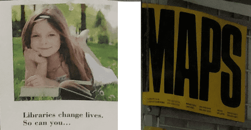
Posting Appeal Factors: Postings with clean typography and minimal textual noise were the ones that caught attention. An instance from the observation had two young adults point out to specific posters to each other. Those posters were the educational listings with minimal text on them. Some posters with Bold typefaces also stood out due to increased emphasis.
Attention Catching Design Elements: Clean Typography, Negative Space and Simple Tones
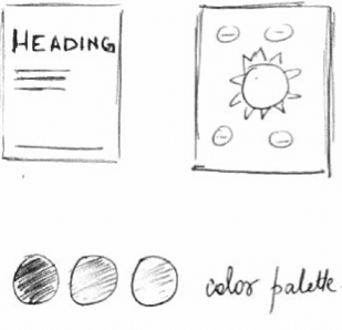
A two-tone color palette was the most effective when surrounding notices were textual. With white background posters in the majority, an inverted color scheme also brought out distinctiveness. A big posting with sharp lines and large negative spaces around made it stand out
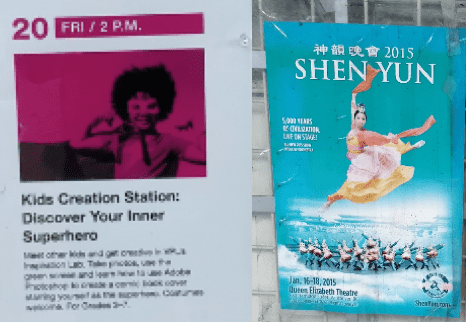
A Human face as a single graphic in the poster also caught a lot of attention. A poster at eye level with a smiling face made a child take notice in my observation.
Human Face (Left) and Bold Type (Right)
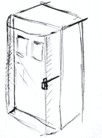
Bulletin Board Appeal Factors: The public library boards had an aesthetically pleasing design. A vintage style akin to a telephone booth sort of shape. The frames outside the board were black in color diverting all attention to lighter toned posters within the frame. The neutral color flooring kept viewer attention locked to the display section. Comparing to Broken glass panes as background. They reduced distinctiveness of posters at our second site.
Black Borders and neutral flooring locks attention
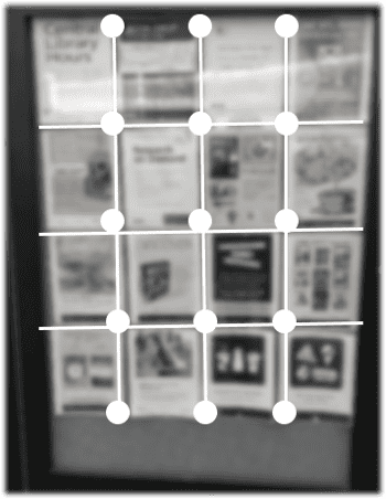
Grid based layout of postings made readability easier. An observed couple gazed over the display row by row. There was no overlap between posters. Whereas, the Gas Town postings overlapped and didn’t followa distinct spatial arrangements. The better boards also provided locks and glass shielding. These housings protected the notices from damage. The unprotected boards at our second observation were also exposed to rainwater splotches and wear.
Glass Shielding and Locks
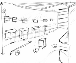
Environment Appeal Factors: The centrally located bulletin boards at the Library benefitted from its strategic positioning. The area had clear segregation between glass walls and stone walls to create this attention space. High ceilings with uniform omnidirectional overhead lighting made the bulletin boards shine prime.
1. Central location 2. Negative attention space 3. Highly illuminated high ceiling 4. Directed Traffic flow
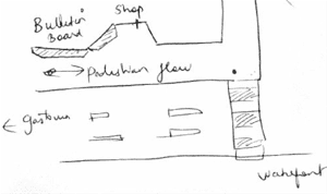
Well measured distance between library entrance and boards made sure people had to maneuver their way around the booth to reach to the eating joints. Some kids played with the booth exterior surface while running around them. Made their parents take notice of the space. The coffee shops were on the other end of the hallway. Such a high traffic eating/drinking spot directed flow towards center. CCTV monitoring in our second site made a person startle who was smoking near the board. Such a poster could play as a deterrent to attention. The Gas Town board was also located in a sort of a blind spot. One side of the passerby traffic ignored it wholly.
Blind spot for incoming pedestrian due to location of board
Discussion
Our study of postings in public spaces point towards some unique characteristics of digital board equivalents. Features that will promote public engagement and discovery. Analyzing the observations about the design of the space, board and poster play an important role. Here we propose some characteristics of a digital bulletin board that will not be shortsighted on limitations compared to the analog space.
Directed Attention Space: Good overhead illumination and tall ceilings in the physical space directs the gaze towards the board. A clear segregation present on two sides of the board also helps. Like, a solid concreate neutral toned wall and a glass wall on opposite sides. This separation focuses people's attention on the board standing between the two.
A digital board could use such optimized positioning to direct attention of users in an intuitive manner. Like its physical counterpart, two different user flows can have a contextually relevant digital board between them. An example could be a board presented post a user’s online reading experience. Placing the bulletin with enough whitespace around it will also direct natural flow of attention.
Directed Attention using whitespace and action positioning
Internal Grid Layout: A tabular or grid layout for the postings inside the digital board will provide quick scan-ability. This is a cause effect relationship that stems from our observation of row wise scanning done by one odd participants. A grid will also provide breathing space and remove viewing fatigue that plagues current digital notice boards. Such an approach also makes bold lines and geometry stand out. Similar category of posts can occupy a logical row or column. This provides users an option to ignore what’s not relevant to them.
Grid Layouts for postings in a digital board
Typeface Weight Animations: Minimal Typography postings which had big emphasized words caught attention. Bold font weights in a sea of thin weight text stood out distinctly. Some posters can also adopt an inverted color scheme for pushing emphasis on headings. A repetitive typographic scheme across all postings will cause viewers to overlook content which happened at our gas town board. The poster that caught attention was the one with the single word ‘Maps’ written in bold. Digital boards can adopt one or two posters in the grid animating between typefaces from thin medium to bold. A single word can transition from a think font to a thicker font. This will direct user attention to engage with the poster. This could also use user input like mouse hover to activate transition.
Typeface transitions on Digital Boards
Singular Human Faces: Postings with singular human faces on them fared well. In our observations, a young child playing around the boards was quick to discover an eye level poster which had a young kid smiling. Even a faded cultural poster with a Chinese woman dancing caught a lot attention. This leads to two design choices for a digital board. A digital posting space could have a handful posters to carry human faces on them. These images will be looking straight into the viewers eyes. Carrying out actions relevant to the content of the posting.
Images with Human Models
Adaption to Profiles: Automatic sourcing of human faces for digital posts will help in making the viewer connect better with the posting. E.g. A middle-aged man who sees a face like his in the poster will react positivetly to the content.
To sum up
Our data led us to four design characteristics for adoption by digital bulletin boards.
- Creating attention spaces around the boards to direct focus.
- Using a grid-based layout for poster scan-ability.
- Using typeface weight transitions
- Adaptive human faces on the generated postings
